3 Ways Your Dashboards Can Inspire Action

We’re all getting busier and busier and it’s hard to keep up with ourselves, let alone everything going on around us.
Sometimes, it helps to stop and evaluate what you’re doing to make sure your approach is as effective and productive as possible.
Today, we’re sharing quick dashboard tips so that you’re not only getting the most out of your data, but you’re inspiring your team members (and yourself) to take action.
3 things you can do right now to make your BrightGauge dashboards work for you
Business intelligence dashboards are awesome because they save you a lot of time. Instead of toggling between a bunch of windows or logging in and out of accounts to get all the metrics you’re interested in, you can just see all your data in one place.
This should make your work day calmer and simpler (two ideas we’re very into).
BrightGauge integrates with a lot of popular tools on the market - like ConnectWise Manage, Webroot, Datto, Salesforce, QuickBooks, Smileback, and more - in the hopes that data insights will help you make better business decisions.
But if you’re not fine-tuning your data, you’re going to end up with analysis paralysis instead of data insights. Information overload. Too much data, too little time. You get the drift.
To avoid that, you can take 3 really simple steps to ensure that you’ll get what you need out of BrightGauge dashboards:
1. Keep your dashboards clean.
What we mean by that is to remove the mess, remove the clutter.
Don’t try to cram every gauge you care about into one single dashboard because it will quickly lose its effectiveness.
Ideally, you’ll be able to view your whole dashboard without having to scroll down or adjust your screen. If you overcrowd it, you run the risk of becoming overwhelmed by too much information, which will prevent you from digesting the important data you’re looking for.
Remember that you can drag your gauges to change the size and get your dashboard to a point that feels nice and calm for you.
A calm dashboard = a higher chance of taking action based on the metrics you see, since there’s less of a chance that anything will fall through the cracks.
2. Take advantage of thresholds.
If you’re monitoring time-sensitive data, like number of servers offline, you’ll definitely want to be alerted to that info sooner rather than later.
That is literally what gauge thresholds do.
You set them up based on your preferences and what you consider to be a warning sign, so your safe zone is completely determined by you.
When you have a gauge with a threshold up on a dashboard, it will change colors and audibly ding based on the parameters you’ve set.
You can even set multiple thresholds for one gauge. For example, the number can turn purple if you reach 1 server offline (i.e., something is off); yellow if you reach 2 servers offline (i.e., it’s not looking good); and red when 3 servers are offline (i.e., this is really bad and immediate action needs to be taken to prevent further issues).
Say you’ve got a TV displaying your BrightGauge dashboard in a room full of busy techs. The second your threshold alarm dings, everyone is made aware of an issue and can immediately react quickly and effectively.
Read more about thresholds here.
3. Use leaderboards to encourage healthy competition.
Leaderboards are quite possibly the most motivating gauge on a dashboard in terms of inspiring your team members to take action.
Leaderboards essentially rank employees based on their performance, whether you’re monitoring the number of tickets they’re closing, the number of dials they’re making, number of hours worked, etc.
You can set up the leaderboard with the parameters that fit your preference and you can assign badges (or icons) to pop up next to each ranking.
When you put this leaderboard up on a dashboard, it becomes visible to everybody. And who doesn’t love seeing their name in the #1 spot? Your team members are going to work hard to see if they can earn that coveted spot.
Add a little more incentive by promising a reward to the top performer. An extra PTO day perhaps?
Always be improving
The more you dive into your data and use tools to assist you, the better you’ll get at knowing exactly what works for you. Little tweaks here or there can pay off in a big way by saving you even more time, getting you to your data even quicker, and motivating your employees to stay focused and productive.
We encourage you to evaluate and clean up your use of gauges, dashboards, and reports a few times a year so you can squeeze all the juice out of your BrightGauge, so to speak.
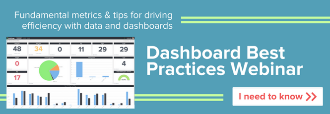
To get even more tips, watch our free webinar, Dashboard Best Practices.
Free MSA Template
Whether you’re planning your first managed services agreement, or you’re ready to overhaul your existing version, we've got you covered!


