How We Use BrightGauge to Track Our Coffee Obsession (Seriously)

At BrightGauge, there’s no confusion about our love for coffee. Whether we’re enjoying our 3pm colada in the office or taking a group field trip to any one of several different coffee shops around town - we’re going to consume the liquid energy in some way every single day. So, one Friday during our group happy hour session, someone asked “how much coffee do you think we really drink?”
.jpg?width=400&name=Image%20from%20iOS%20(5).jpg)
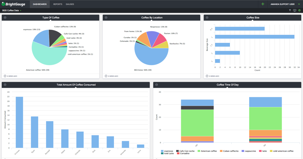
Being pretty obsessed with data is our M.O. at BrightGauge, so decided to let a dashboard speak for itself. Here’s what we came up with:
Now if you keep up with most of our product features, updates and announcements, you may be asking yourself how we put together this sweet dashboard. Did they announce some new coffee integration I missed?
Don’t worry - you haven’t missed any breaking news from our team! However, if you haven’t yet used our awesome Dropbox integration, let’s take a closer look at the coffee data journey and how it all came to be.
First, you should know that our Dropbox integration lets us pull in any data via a CSV… so, if you’ve seen Brian’s Wine Inventory dashboard you know how easy it is to think outside the Service Provider box on ways you can use our platform. Using the same process, we decided to put together the key metrics of our coffee consumption.
What data to gather
The first question we asked ourselves is “what questions do we want to answer?”. Obviously we wanted to know about quantity but that naturally led to other questions we might want to know. Here are the 5 topics we came up with:
- Beverage Size - to help us track the most popular serving quantity
- Type of Beverage - to see the type of brew
- Location - to compare coffee consumed in office vs. at a coffee shop
- Time of Day - to understand when people were drinking coffee
- Amount of Coffee Consumed - to see who consumes the most coffee overall
Getting the Data into BrightGauge
We started gathering the data manually via our coffee Slack channel but that quickly proved to be too manual (although it did start some phenomenal conversations about coffee):
So, we set up a Google Form to easily ask the necessary questions (you could also use SurveyMonkey), but the best part is that Google Forms will automatically drop the data into a Google Sheet. This allowed us to have the team fill out the link on a daily basis and collect the data without all the hassle of the manual process. Once we had enough data we exported it to a CSV.
Now that we had collected enough data and exported to a CSV, we simply uploaded the CSV via Dropbox to BrightGauge as a dataset. That allowed me to create the gauges you see below.
Making Sense Of the Data
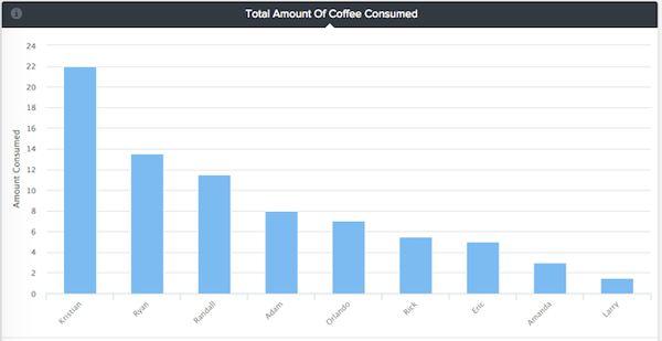
As you can see from the gauge below, Kristian is by far our biggest coffee drinker - it makes sense given that he leads our Support and we need him “on” all the time:
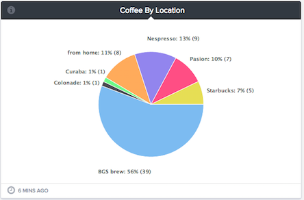
It's also easy to see that the most popular option is to make coffee at the office and enjoy it in the company of our teammates:
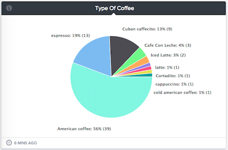
It also makes sense that American coffee is our most popular option since the BGS Brew (the winner from the gauge above) is American. Although, we did just get a Cuban coffee maker and so I suspect that “slice of the pie” will be increasing over the coming weeks.
How Will You Apply This To Your Business?
Many times you have questions you want answers to, but no easy way to gather the data and display for others to see. Whether it’s Customer Satisfaction Surveys, Employee Surveys, Manufacturer Warranties Expiring, tracking supply inventory, or anything else - by using the BrightGauge + Dropbox integration you’re able to pull that data in and begin to analyze and visualize your data.
Stay tuned for more updates on the BrightGauge crew’s coffee of choice, and tell us... what fun data are you visualizing with your dashboards?
*Note: this post was originally published in 2015 and has been updated for accuracy.
Free MSA Template
Whether you’re planning your first managed services agreement, or you’re ready to overhaul your existing version, we've got you covered!
