Measures, Dimensions & More

Our new Custom Gauge Builder in our 3.0 Release brings a lot of power to “slice & dice” data easily and intuitively. To achieve our goals of simplicity and much utility, we have introduced some standard data visualization terms and functions which we describe below:
Measures
A measure is a value that is aggregated from an existing raw field within your dataset (count of tickets, average time to resolution, total revenue... these are all measures). In the context of data visualization, measures typically map to the Y axis of a chart.
Measures also typically refer to quantitative data, such as number of tickets opened, average time to respond, utilization rates, etc. For instance, you might calculate the Average Response Time per day over 90 Days. In this case, the Response Time field is your measure because you want to get the average response time across the date range you selected (which brings us to Dimensions).
Dimensions
Dimensions are the slicing and dicing of a Measure. They usually refer to categorical data, such as engineer name, ticket status, or even units of time (i.e. day, week, month). Generally, dimensions are used to group quantitative data (measures) into useful categories (i.e. number of tickets closed by engineer). These fields typically map to the X axis in a line chart or vertical bar chart.
In the example above about Average Response Time Per Day Over 90 Days, the 90 days is your Dimension. And for a non date range graph like “Tickets Closed by Engineer”, the Engineer is your dimension since you are trying to Measure the # of Tickets Closed against that dimension.
Aggregation Functions
Aggregation functions within BrightGauge perform a calculation on a set of values you have selected and result in a single value. For example, a measure that contains the values 2, 5, 4, 1, 6 aggregated as a SUM results in a single value: 18.
How this applies to a bar chart using (PSA as a datasource for example) is as follows. If you have 100 Service Tickets from 25 End Users in your data source, you probably want to view the total number of Service Tickets created by each End User so that you can decide which End Users are opening up the most Service Tickets. In this example, you would select Service Ticket IDs as your Measure and apply the COUNT Aggregation Function. And you would select the End User field as a Dimension so you can view the Count of Service tickets per End User.
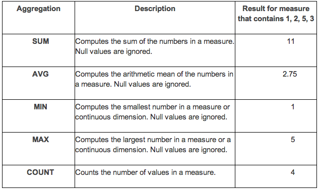
BrightGauge provides a set of predefined aggregations that are shown in the table below:
Filters
Filtering is very important within the BrightGauge Gauge Builder. Depending on the field type you will be allowed to do different styles of filter.
To learn more about how BrightGauge can help you with your data visualization needs you can request a demo with our team.
Free MSA Template
Whether you’re planning your first managed services agreement, or you’re ready to overhaul your existing version, we've got you covered!


