Just when you were considering how many more screens would be necessary to showcase all your best metrics, the team at BrightGauge saves the day with an exciting new update! With our new rotating ...
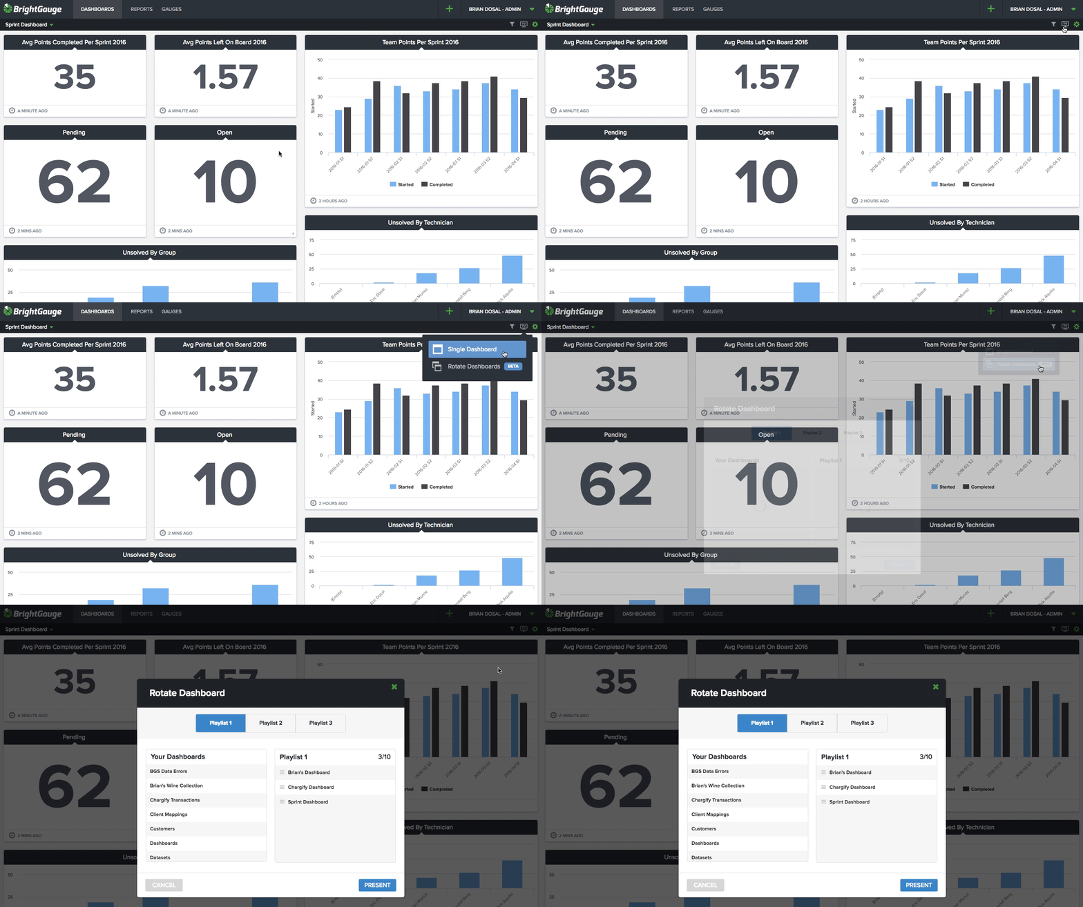
Just when you were considering how many more screens would be necessary to showcase all your best metrics, the team at BrightGauge saves the day with an exciting new update! With our new rotating dashboards feature, you can now keep as many gauges as you need in sight. No more trying to squeeze as much as possible into one display… give your data the space it needs to shine! Currently, the interval / timer is set to rotate a dashboard every 2 minutes and the next dashboard will fade in when it’s time. Plus, you can always pause the rotation if you would like to stay on a dashboard for a while and you can skip ahead to another dashboard from the dropdown list in TV mode. Here’s how rotating dashboards work: When viewing a dashboard and clicking on the TV button on the top right, you are now presented the option to select a single dashboard (the one you are on) or to rotate dashboards. If you select rotate dashboards, a modal comes up with the option to choose a playlist to play or to configure a playlists. There are three playlists and each one is private to your user account so not to worry, customize away! You can drag dashboards over from your list on the left and re-order as you please on the right. The playlists are saved when you press “Save & Present” or “Present” so you can reuse them over and over again. (get all the details here) Now, get to rotating some of your favorite dashboards and let us know what you think about this new feature!

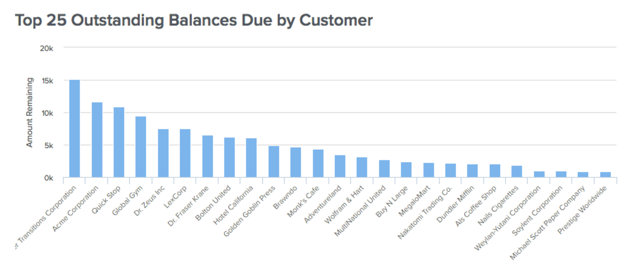
If you are like most IT Service Providers you rely on your monthly Profit & Loss Statements (P&L) to do a deep dive into your financials but P&Ls are usually delivered a few days after month end. The problem with this approach is the potential negative impact to your cash flow from having too many invoices outstanding. But rather than having to wait until the end of the month you can now have access to these key metrics in real time. Here are a few of our most popular gauges relating to Accounts Receivables and how you can leverage them within your business. A simple visual like the one above gives you a quick snapshot into which customers have the largest outstanding balances across your entire customer base. Typically your largest customers have the largest outstanding balance, however, by understanding the total amount and how it compares to others is important to make sure it’s not over weighted to any one particular customer. And when you target your invoice collection follow up you can start with the ones that will make the biggest impact. See how easy it is to keep Accounts Receivable data at your fingertips Another popular view for Accounts Receivable is to break them up by amount of time past due to see which customers are the biggest violators of your terms. The goal should be to keep as much as possible current, meaning they are still within their terms of payment. However, just about any business will still have a lagging payment here and there and using an Aging Detail report will allow you to quickly spot any problem customers that might have slipped and are now past due. Now that you know which customers are past due and what their balances are, it’s easy to follow up with your customers to get paid. With our Outstanding Invoices Details you can quickly see each individual invoice that’s outstanding and all the necessary details about each to properly follow up. Cash is the oxygen of any business and understanding where your outstanding balances are is a critical metric to track on a regular basis. Remember that “regular basis” doesn’t mean waiting until the end of the month because then it might be too late to make the changes that will impact your bottom line. Instead, by leveraging our QuickBooks Desktop integration you’re able to see this information in real time and deliver to the appropriate team member to follow up.

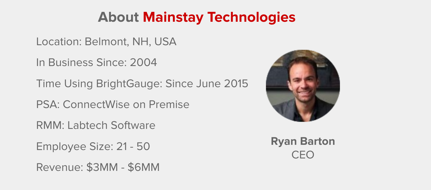
[Case Study] In days past, the team at Mainstay Technologies had no Business Intelligence solution. They utilized reports available in their ConnectWise and LabTech, or built SQL reports from time to time, but the process was slow and didn’t always look good enough to share with clients. Mainstay CEO, Ryan Barton, knew that visualizing data, understanding it and the things related to it would be the key to best govern the actions necessary for the growing IT Services company. But he was also frustrated that his team didn’t have enough visibility from their PSA and RMM data, because that’s where 98% of their business is. The more he studied the correlation between good data and good judgement in business, the more Ryan knew it would be difficult to grow and have a good sense of where they are if the team didn’t have a handle on their data. There were times when a huge problem was looming for months but since the team lacked the necessary insights, nobody realized the issue until it was too late - like the time patches weren’t installing properly for months on end. Adopting BrightGauge When he started looking for a customizable BI solution, Ryan demoed several different solutions priced at tens of thousands of dollars per year, plus extensive time would be necessary to get any of the products working specifically for a MSP. That’s when it dawned on him that what Mainstay really needed was a tool that really understands the MSP industry and had the defaults and templates built out already. As Ryan explains, “if you put a red slice of pie on the tv on the wall, it’s going to drive action in a way that talking about it never will”. Once Ryan made the decision to join the BrightGauge community, each area of the business was able to identify and implement the best solution that would help them properly track their KPIs, whether it was dashboards, internal or external reporting. For example, in Centralized Services, they use dashboards and are constantly watching what updates and antivirus are doing. When it comes to clients, reporting is a big value add. Mainstay focuses on 2 primary reports. First, there’s a client-facing one that drives conversation and shows the value and visibility into what they are doing. Ryan emphasizes that it’s exciting for his team to hear feedback from operationally-astute customers because those organizations immediately see the Business Intelligence that Mainstay is leveraging, and it gives them a great competitive edge. Second, there’s an internal report that tracks ticket trends, feedback scores, response times, infrastructure health, aging summaries (over 5 years, expired warranties, etc.) and even financial profitability. The ability to sit with the team and do a quick planning session is now almost effortless because the data is right in front of them. As for the impact his BrightGauge has on asset management, Ryan explains that because Mainstay has a defined minimum standard for service delivery and can keep clients at that point, the result is noticeably less stress within the team. With a more standardized setup, the team has become far more efficient at delivering service and driving more projects when gaps are identified. The result is more problems solved, increased revenue, more efficiency, higher team satisfaction, and of course even more client satisfaction (you remember... the well-known sentiment that happy employees equal happy customers!) Results with BrightGauge Since their BrightGauge integration, Mainstay now has more visibility and command over centralized services than they ever had before. Plus, with their new ability to put specific processes and operations in place, Ryan and his team have more confidence in their data because it can now be put into an actionable format. By utilizing BrightGauge for their Business Intelligence solution, Mainstay has “transformed from being at the industry standard install rate of about 95%, to now about 99% because we have the exact visibility into when updates were last installed and on which machines, how many are missing, and when they were last rebooted. We can see it, customize it, and immediately get answers to questions”. While the team started with BrightGauge in Centralized Services, Ryan was quick to realize the potential at hand for other areas of the business that could be positively impacted with more visibility. In no time, the team was leveraging data to track infrastructure health, service management for stale tickets, project management, client management, individual accountability, uptime, system health, and more. When those areas were up and running, Mainstay decided BrightGauge could help with staffing and capacity decisions, track who’s solving which tickets and the different types of tickets, trend analysis, and the number of tickets as compared to the number of hours and response times. Ryan sums it up best when he explains “having visibility into our data with access to the kinds of customization that makes it accurate and in a meaningful format, actually drives action”. Recommending BrightGauge For MSPs who are just getting started on their data journey, Ryan offers a bit of advice: “start with one challenge that you know good data will help to solve and if you can just focus on that one thing and rally around it, then you will start to see results instead of doing 40% on several different projects. Most companies get caught by the gaps they didn’t even know were there. Good data allows you to be proactive rather than reactive."

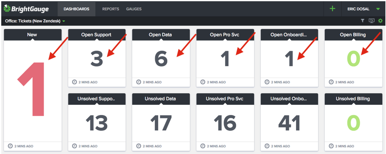
One of my favorite teams at BrightGauge is our Customer Success Team. We have 3 awesome fellas on the team (and looking to hire 1 more if you know of anyone) which is lead by our Customer Success Manager, Randall Berg. The team does a great job making sure our customers get onboarded once they sign up, receive the proper training, offer any assistance with customization they might need and of course address any support related questions that come up during the process. With the functions of the team easily divided, we then started tracking how many open requests each function had. As you can see from the screenshot below we break out the tickets received by group and then our goal is to keep the “Open” count at zero. This allows us to “Manage by Exception” or “Manage to Zero” making it very easy for everyone to see how we’re doing. This dashboard has 2 goals which are “No Red” and “Get to Zero”. No Red - Using our colors and threshold features, we have assigned certain benchmarks for our numbers that indicate a problem. In the example above, the “New Tickets” is in red because we never want to have any tickets in New status that we haven’t responded to. Additionally, we have other thresholds for Open tickets. For example, if there are 10 open support tickets the number turns red. This makes it very easy to identify problem areas that need to be addressed quickly. Get to Zero - The second goal is to ensure that all the numbers in the top row (our Open Tickets for each group) are at zero, meaning the next step is waiting on the customer and not us. Once they are at zero the color turns green (using our colors and thresholds) as you can see on the right in the Billing group. While it’s so easy to make gauges and keep track of many different metrics on the Customer Success dashboard, we have to ensure that our team can easily get a snapshot of their performance throughout each day. By implementing two simple rules, “No Red” and “Get to Zero”, it makes for an effortless solution to keep everyone on the same page and accomplishing the right task at the right time.

If you read the title of our latest episode, you may be wondering why a software company would be asking for advice from a real estate company, but the answer is simple. At BrightGauge, we often hear questions from our community asking for advice on building, managing, and growing sales teams… and almost everyone faces the same challenges no matter what line of business they’re in. We asked Gabe Martin to join us for a conversation based on his experience as Sales Manager for one of the highest-ranking residential real estate sales teams in the United States. Gabe has the answers to all the questions we hear so often: from recruiting based on personality types, to managing the day to day and weekly responsibilities, focusing the team’s efforts and much more. So whether you’re running a MSP or any other business, you’ll be able to gain some new insights and ideas about your own sales team. How to Find, Manage & Monitor a Sales Dream Team: Episode Highlights Gabe’s introduction and background (1:08) Why we invited a real-estate person to join our podcast (3:46) Gabe’s approach to the hiring process for sales people (4:33) The DISC personality profile (5:52) Next steps for personality matches (9:04) The best way to get a feel for who an interviewee really is (11:42) The numbers behind interviewing and hiring sales people (12:49) Managing the team day-to-day (13:47) The number of dials and contact rate in a 3-hour period (16:12) One-on-one meeting agenda (17:30) Remediation for team members who fall off track (23:47) Metrics Gabe tracks (24:51) Driving team competition (26:52) How to promote team bonding and camaraderie (29:27) The best business book and podcasts Gabe recommends (31:20) Resources that Gabe uses to get better every day (34:50) Parting advice for SMBs (36:20) As referenced in the episode: The Miracle Morning: The Not-So-Obvious Secret Guaranteed to Transform Your Life by Hal Elrod Want to find out more about The BrightGauge Podcast? Check out all the episodes here.

70+ Metrics for MSPs
Key metrics and accompanying formulas to help MSPs skyrocket growth and success!
Get your KPIs

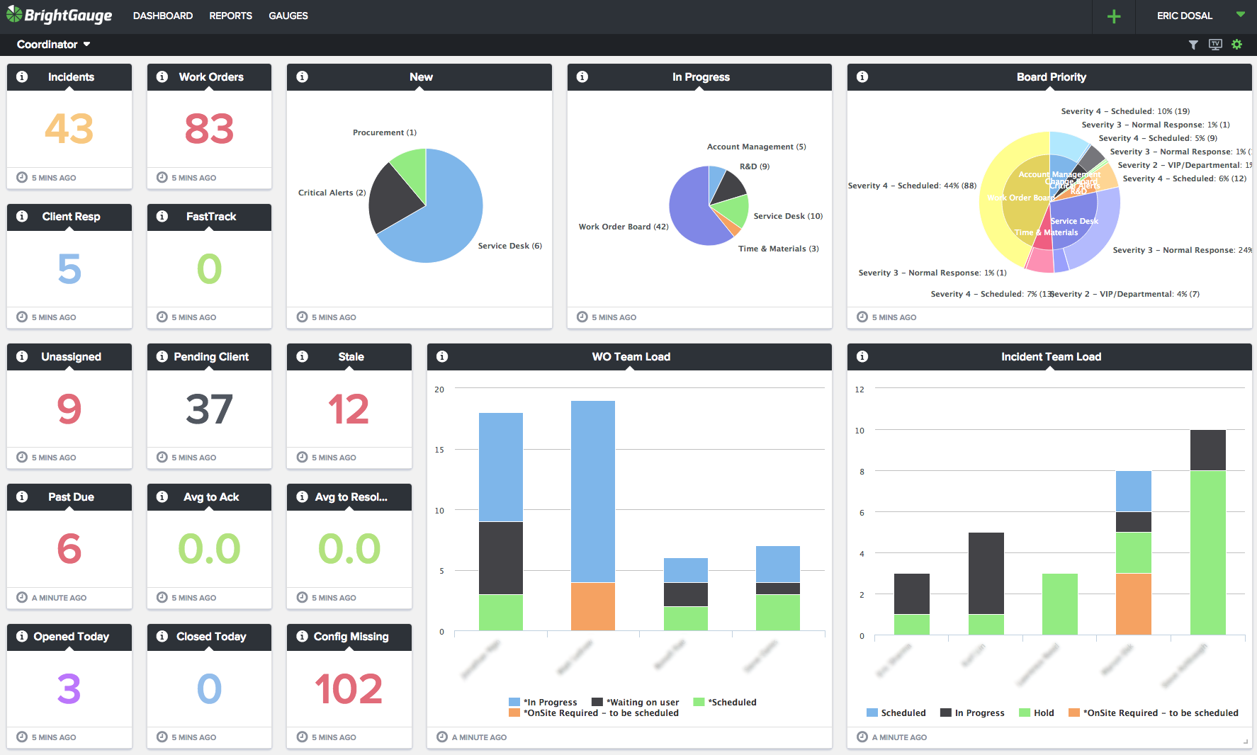
So much data, so little time. You hear about it a lot lately, in business publications, social media, maybe even in some of your company meetings... but what is data visualization, and why are so many companies now looking to jump on board with a visual solution? Businesses today are moving faster than ever, and running any successful company means making decisions that will best benefit the business in the long term. Hopefully those decisions are made using data instead of gut feelings, but data can present a problem of its own. Most companies have tons of data at their fingertips and running reports is not only time consuming, but it can also be overwhelming to compare trends in the data at hand. Take my own recent experience digging through a pile of information that I needed to sort quickly. I was working on some new marketing content with our CEO, Eric, when the conversation turned to the best channel we should use to reach our community. He asked me to pull the stats to show our most popular avenues - email, podcast, social media, etc. You may think this would be an easy task, considering we’re a data company and all, but like so many of you have probably experienced I hit the wall of what we call a data silo. Our marketing platform, HubSpot, unfortunately doesn’t offer much in the way of charts and dashboards (although we still love their product). So there I was, creating a list, exporting the data to CSV, and then importing the CSV into a spreadsheet so that I could make a nice pie chart to share with Eric. What a pain! Fortunately for me this time, I was only pulling the data behind one topic, or else this project could have taken ages. Why do visuals even matter? After the nightmare of all the shuffling from one software to another, it would be easy to lose sight of why making that pie chart was so important in the first place. Using graphic images or charts to present data isn’t just about a sweet-looking way to decorate your walls and represent numbers. It’s also the best way for a human brain to analyze and comprehend the numbers as seen before it. By placing data in a graphical form, the end user can easily understand the significance of the data before them, compare multiple pieces of data or even set goals and objectives based on the data. In fact, here are a few stats to help us explain just how important visuals are when it comes to interpreting data: The human brain can process entire images that the eye sees for as little as 13 milliseconds (source: MIT neuroscientists) About 80% of the information we take in is by eye (source: TED study on Visualizing Data) The human brain processes visuals 60,000 times faster than words (source: Dr. Lynell Burmark) But that’s not all. Data visualization is not only the fastest way to show data, it’s also a key factor in the impact and recollection factor. According to Forrester research, “When we hear a piece of information, we remember 10% of it three days later; if we add a picture, we remember 65% of it.” Now that’s a stat worth remembering! visualizing Service Coordinator results in dashboard form is the easiest and fastest way to comprehend the data When it comes to the best way that you can manage and grow your business, start by making sense of your data. Use a visual solution to translate trends into business intelligence that’s easy to understand, and if you have questions about how to better manage your data, reach out to our team to learn more.

Welcome back to Part 5 in our series on The People Behind the Product. If you missed blogs 1-4, the idea behind the theme is to help introduce the personalities that are working hard at BrightGauge HQ every day to continue building and growing the platform that we all love so much. So far we’ve covered our favorite movies, original hometowns, favorite places to eat, and treasured vacation spots. Now it’s time to talk athletics with a look at our number one sports! Steve: I'm not a massive sports fan but I watch a lot of soccer, mostly the English Premier League. The fans are really passionate and it's contagious. The build up that happens leading up to a goal is really exciting and once your team scores you can really get nuts. Eric: Baseball is my favorite sport growing up and I played all through college (#CollegeAthlete #HumbleBrag) but I've really enjoyed watching the World Cup and get into the games. So Soccer is quickly becoming my favorite sport to watch but that's only once every 4 years. Francisco: Soccer. Ever since I was 8, I have been playing soccer. Every time I play, I feel full of energy and hours can go by without me even realizing. David: Despite not being much of a sports fan I enjoy playing tennis. As a child I remember seeing a match on the television and telling my mother that I wanted to play it and she enrolled me in classes. It's a sport of finesse/control, endurance and quickness that's fun to play. Kristian: Basketball has always been my favorite sport since I was kid. It’s easy to coordinate a few friends and get a pickup game going and it’s a nonstop action sport to both play and watch. Football is definitely up on my list too, as watching College and NFL games is a weekly ritual in our household. While physically playing and coordinating football games is a bit more difficult, participating in Fantasy Football leagues is just as fun and competitive. Adam: Don't really play or watch much sports unless I'm with a group of friends who are already doing it. If I had to choose it would probably be basketball. Brian: Golf. It's a beautiful sport to play both visually in usually great open spaces but also what it commands in players. It commands mental control, risk management, and a strong sense of ethic. Amanda: I’m not into team sports at all (although I did win our BrightGauge 2015 Fantasy Football league… just sayin’ that’s a huge accomplishment considering I don’t keep up with sports). Do things like kayaking and whitewater rafting count here? If so, we’ll go with that. Oh and I want to try stand-up paddleboarding soon. Larry: Basketball. Both playing and watching it. Really fun sport to play recreationally, but can appreciate it being played at the collegiate or professional level. Rick: I don't enjoy sports. I enjoy rooting for your favorite team's nemesis. Orlando: Football for watching and Basketball for playing. I also enjoy playing softball but that's much harder to organize than basketball. Ryan: Soccer. I love watching (Chelsea FC and USA supporter) and playing. Played competitively since age 4. Randall: Basketball, both playing and watching. It's fast, which is perfect for watching, and because I like to play it, I can relate to what the players are doing. Do you see any of your favorites on the list? Tell us about your sports skills and what keeps you moving in your downtime!

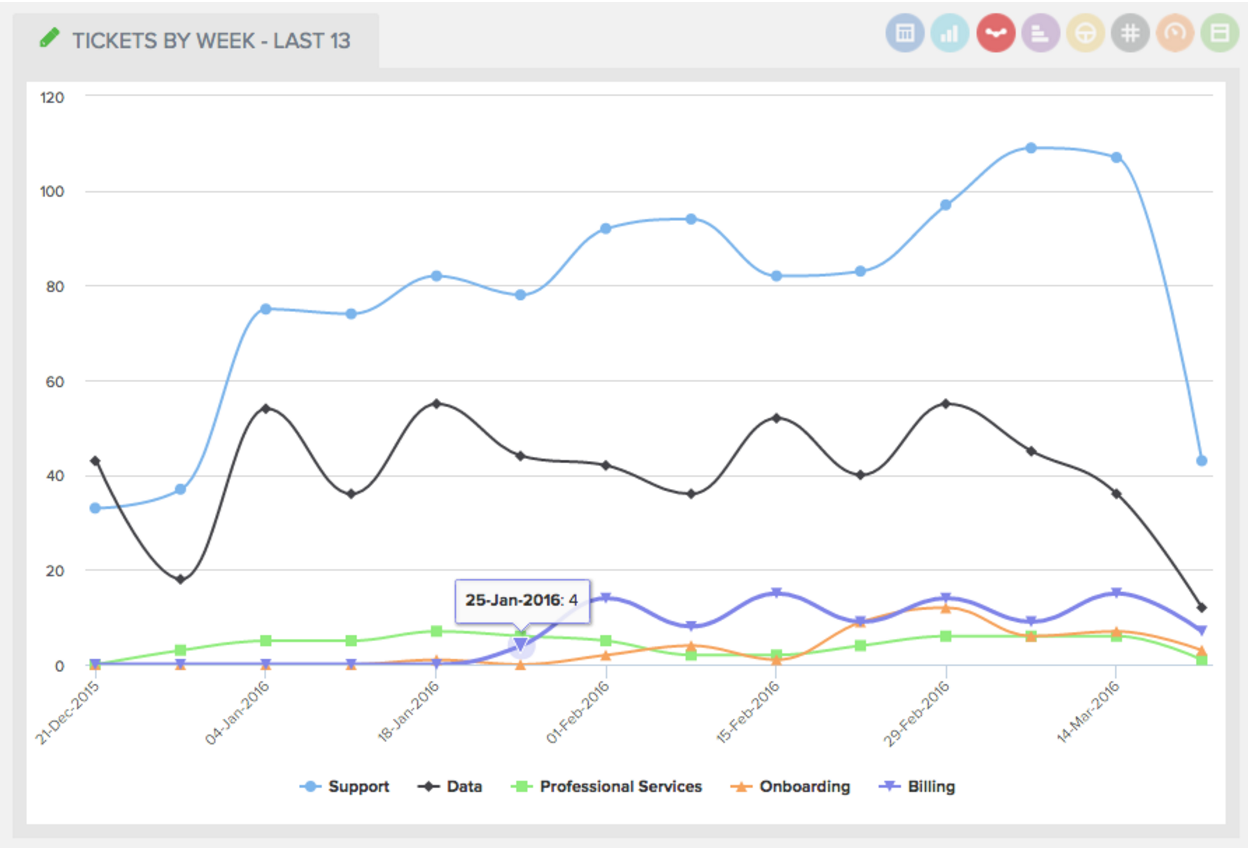
We love data and our customers love data, but data is just a part of the story when looking at a data-driven lifestyle. From the data, we need to gather insights because insights make us aware of what areas of our business we need to better manage and focus on. Here are a few insights your Service Manager can glean from the right metrics showing the right data... How busy is my team? This trending line graph allows you to visually determine whether your team is experiencing a spike in volume or whether activity is within your normal range. By having this metric handy you can quickly and easily make changes to your team and staff up as necessary. How busy are each of my team members? With a simple scan of our bar chart of “Currently Open Tickets by Member” you can quickly see at a glance how busy each team member is. More importantly, you also see how busy they are in relation to one another which gives you an opportunity to move work from one member to another. How efficient are my team members? With a bar graph similar to Currently Open Tickets by Member, this gauge shows which of your team members are closing the most tickets. If a team member is following behind others it might signal a coaching opportunity is needed or perhaps they need to be better trained. While the fast-paced world of MSPs revolve around so much data, make sure that you’re focusing first on the metrics that will make the biggest impact for your business. To learn more about how to identify the ‘right’ metrics that will ensure your success, download our free whitepaper.
Do you ever wonder what everyone else is doing with their data? How they're leveraging it to help grow their business and keep their customers happy at the same time? Everyone loves a little dashboard inspiration, especially if it comes from a Power User. That's why we asked Shann Bosnell, VP of Technology at TUC Managed IT Solutions to lead a Show & Tell webinar with our community. He shared all the Best Practices his team uses every day to help manage the business. Topics covered during Shann’s presentation: How TUC uses data for their ITSM team Real-life examples of dashboards used by TUC's Sales Team The custom gauges that help TUC uncover sales opportunities across their client base and so much more! Shann’s BrightGauge tour is available on demand by clicking the image below:

Pre-BrightGauge Stephen Menendez grew up in the Miami area, a pretty common trend within our team of mostly-local talent. After graduating high school, Stephen set off for the Virgin Islands to study marine biology. He became a Certified Scuba Diver and not long after that, he realized that marine biology wasn’t his calling. So he packed up and headed back home along with a transfer to Florida International University where he kicked off his studies with Economics and International Relations. It wasn’t too long before Stephen’s dad convinced him that he should give the family business a shot in the textile industry. He commenced to packing and moving again, this time to New York where he enrolled in the Fashion Institute of Technology to study textiles. He took up a Sales position in the family business and interned at other textile-related companies; during the summers he would head off to the Dominican Republic to learn as much as possible about sewing garments, printing textiles and spinning yarn. It took 2 years, but Stephen decided that working for the family business was not a path that he wanted to take. He realized that Miami was calling him home and he was ready to pave his own road. After get settled in ‘the 305’ as it’s known, he completed his Bachelor’s in Economics and set out to forge his way in the career world. Welcome to BrightGauge Stephen heard about the opening for a Business Development Rep at BrightGauge, and while he was excited to apply, he tells us that it was his conversation with our CEO, Eric Dosal, that made him realize the opportunity was worth chasing. The discussion centered around the drive and spirit that shape our values, goals, and vision at BrightGauge and Stephen knew immediately that BrightGauge was the opportunity he was looking for. Plus, he loved the culture and the product passion that our team emphasizes so much. As Stephen explains, “not only is everyone passionate about what they are doing, but they are experts in their field and it is truly admirable.” As Business Development Rep, Stephen will play a key role in our SMarketing team, as the piece of the puzzle that will work with Marketing-qualified leads to turn them into leads who are ready for a product demo with Sales. From his own words, Stephen tells us that he’s excited about the opportunity to help grow the BrightGauge community and “crush sales”. After hours Outside of the office Stephen enjoys creating music. He’s been known to play the piano, drums, guitar, bass, and harmonica. We also hear Stephen has a passion for cooking and he likes to invite close friends over at least once a week to cook for them. We’re still waiting for a special BrightGauge team meal to try out his handiwork, but we feel confident that we’re going to enjoy every bite! Please join us in welcoming Stephen to team BrightGauge!

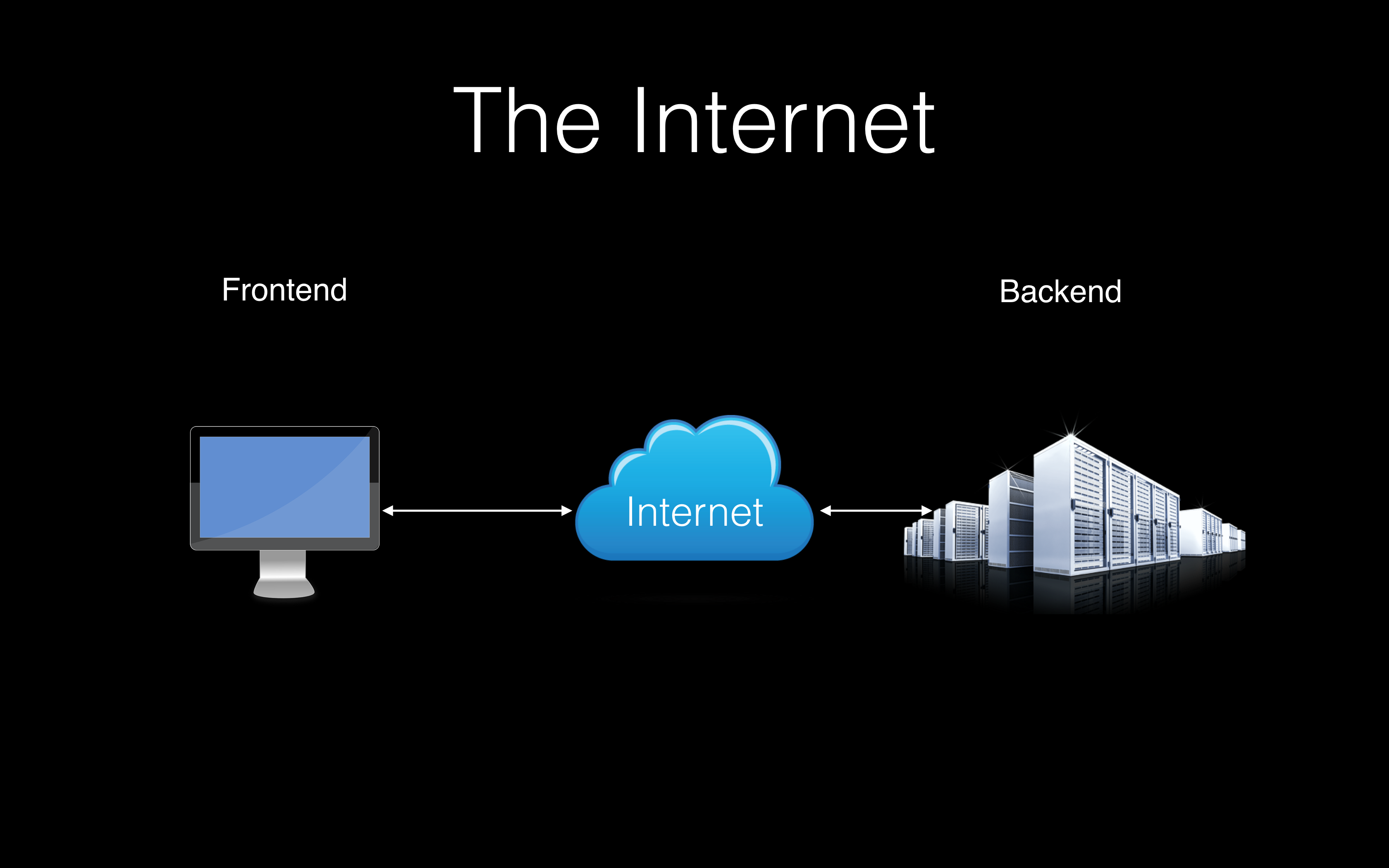
How & Why We Kicked Off Lunch and Learns During my time at BrightGauge over the last two years the company has practically doubled its employee count now that we’re at 15 people. Since joining, we’ve changed offices twice and are now in an open office suite (which thankfully now includes a kitchenette). At our current size being a part of everyone’s daily tasks whether directly helping, or just being around them, seeing or hearing them make magic happen occurs less often than when I originally joined. Sure, we may know each other’s official titles but not what they may mean in terms of their day-to-day tasks. Late last year Amanda McCluney, our Marketing Coordinator, gave an incredibly insightful inbound marketing presentation at a meet up event outside of the office. Considering her awesome content and the fact that the entire company was not at the meet up, we decided to bring that presentation in-house. Better yet it sparked in me the idea to suggest that we shine light on each team member’s domain within the company in some form. Something like it had already been proposed and we ended up with what we now call a ‘Lunch and Learn’ – not an entirely new concept. At BrightGauge, we have semi-monthly company-wide status lunch gatherings known as Rambo Pizza meetings. The Lunch and Learns were slated to occur monthly after those meetings. In January for my presentation I took the opportunity to walk our Growth Team (I’m on the Product Team) through some basics of what JavaScript – the programming language I use daily – can accomplish in the browser. Considering my audience and ~20-minute time restriction, I decided to focus on a high-level overview of JavaScript and then augment that overview with a rich demo page filled with examples of it in action: How Do You Explain JavaScript? First and foremost to do this, I began with a high-level perspective of how the internet works. Three entities are involved with browsing the internet. In the picture, we see three distinct entities: a computer display (the front-end), a cloud (representing the internet) and racks of servers (representing the back-end). The display represents whatever device someone may be using to access the internet with a browser. That person would typically enter a URL into their browser which is then looked up on the internet until some server responds, transmitting its response via the internet back to the browser. That response will usually include an HTML page for the user to view. That HTML consists purely of text but not all of that text is intended for the user to read. Some of that text response can include text that specifies what media (images, audio, video) are to be included, hierarchy/structure of parts of the text within the page, instructions for the page’s appearance/layout and of course, the main feature of this post: JavaScript for added functionality. Now what? At this point, in a plain webpage example that is, all the content required for the page would’ve been sent to and now lives ‘client-side’ – in the user’s computer. One could disconnect their computer from the internet and observe that the content of their page would still be there. Now we can talk about some of JavaScript’s capabilities. At a high level, JavaScript is a programming language used by your browser to interact with the content of a webpage. These interactions will typically include things that users can see but can affect other things – i.e., sending data back to the server without any indication of such activity. These changes can also happen entirely on the user’s computer without needing the internet (except for sending data like I mentioned)! What kinds of interactions are we talking about? Lots of them! I can give you examples starting with a single, globally popular service we all have likely used at one point: Google.com. When you visit Google’s homepage to search for something, you see a single input field for your keyword. Notice that as soon as you begin typing, that centered input field changes and then you’re inputting text at the top of the page, a dropdown list of suggested keywords appear below your query and on pressing enter, results appear underneath that input field. While you are seeing all of these changes happen, you are actually on the same webpage and JavaScript has allowed it all to happen. From changing the input field position once you type something in, changing the URL so that it reflects what you’re looking for when you press enter, to displaying the suggested search terms and of course ultimately asking Google for the results of your query and finally displaying them. The search suggestions and results do, in fact, show up after initially loading the page and after sending/receiving data to Google’s servers about your query but JavaScript allows that to happen – and happen fast. Some of Google’s awesome JavaScript at work. Demo Time Keeping in mind that the intention of the presentation was to give a brief overview, I built a demo page to illustrate some of the more user event-driven aspects of JavaScript to provide the biggest “wow” factor for the team. To speed up the development of this page I used a few pre-existing JavaScript libraries namely jQuery and Semantic-UI. Using JavaScript libraries provides you with out-of-the-box functionality for common features without needing to write out that functionality yourself. Semantic-UI, as used on the page, makes creating a popup, accordion menu and show/hide animations trivial. There are a plethora of other libraries available offering wide features – from D3.js to help create rich charts to ClippyJS that lets you bring back an old Microsoft favorite character. I used these libraries to help me create four sections of interactions – all showing their corresponding code – for highlighting ways in which JavaScript, in the browser, without an internet connection, can affect one’s web experience. The sections in the demo are: Abracadabra In this section, there is a paragraph of plain text and a button that toggles the visibility of that paragraph element. Here I highlight how, using JavaScript, it is possible to manipulate a webpage’s content after it has been loaded. Using JavaScript to show/hide elements. Login to Skynet Unlike Abracadabra which was a more frivolous, warmup demo, this section presents standard-looking username and password fields prevalent on websites today. In this demo, we see that with JavaScript it’s possible to access data a user types into a webpage. On clicking submit, the username and hidden password get copied and displayed – including the previously hidden password – in fields to the right of where the user typed. Copying input field data, including a password field into another element. Mousing Around This section, as its name alludes to, involves four purely mouse-based activities. The first highlights how it is possible to be aware of when the mouse cursor is placed over a particular element on a webpage and then carry out an action when that happens. The second item does the same but is based on a user double-clicking an element, at which point a third-party JavaScript library (Semantic UI) is used to display a popup. The last two items show how JavaScript is even able to disable right-clicking for context menus. Experiment with mouse events: hovering, double-click and right-click. Keyboard Fun With all of the demo activities above, I had members of our Growth team show them off. This last section was the most sinister fun to show off. For this demo the user was asked to type the following phrase into a texarea element: The quick brown fox jumps over the lazy dog. On typing the input, as you’ll see in the demo, one of the keys is barred from being input. After noticing that, I then asked our participant to get the phrase into the element using any other means. One could copy the text but then they would see that right clicking is disabled when trying to use the context menu to paste the value in. Using the keyboard shortcuts for the Control/Command (on Mac) + V were also barred. Both restricted activities triggered popups. Playing with the keydown keyboard events. Bonus Goodie! As a bonus, almost hidden goodie, I added functionality to demonstrate that a webpage can be aware of whether or not a user is actively in the webpage window – i.e., it is the currently focused window. Try it out. I hope you enjoyed this overview as much as I enjoyed spending way too much time crafting the demo page for it which was fun. Feel free to reach out to me at dsmall [at] brightgauge [dot] com if you have any feedback, questions or praise.
