Unless you live under a rock, you’ve probably heard by now that sales and marketing processes are changing. People don’t want to be sold to anymore, instead they want to make informed buying ...
Unless you live under a rock, you’ve probably heard by now that sales and marketing processes are changing. People don’t want to be sold to anymore, instead they want to make informed buying decisions based on their own research from sources they feel are trustworthy. Almost 2 years ago, I started doing some research of my own when it came to marketing. I was working for a company that still focused on the old sales team approach, relying heavily on cold calls while crossing fingers and hoping that someone on the other end of the line would give them the time of day - “smiling and dialing” as we called it. Long story short, I knew how I handled those same types of cold calls from vendors when I received them and I couldn’t believe that any modern company still put most of their faith in this type of system. I decided that I needed to focus on fresh marketing ideas and a company that could ‘see the light’ so to speak, so I set my focus on the Inbound Marketing movement and never looked back. My first focus was getting Inbound Certified, an online course offered by HubSpot, one of the world’s most well-known marketing automation platforms. Inbound Evangelist I’ve learned so much in these last 2 years, and most importantly I’ve had a lot of fun doing it! With the Certification under my belt and also some freelance work experience focusing on content creation, I set out to find a company that valued the inbound methodology. Since joining the BrightGauge team 6 months ago (where we only focus on HubSpot’s inbound methodology), I’ve also completed my HubSpot Certification, started attending local events for the Tech community, and in general spent time explaining what my job is and why I love it to anyone willing to listen. So when I was recently invited to speak at an Inbound Marketing workshop in Miami, I was eager to help teach others about how inbound works and the results we see at BrightGauge. The feedback was great from the workshop attendees and with my new mission to help others who are curious about inbound, I decided to recap my presentation here. speaking at the Rebound with Inbound content marketing workshop at City Tech Miami What is Inbound? Put simply, inbound marketing focuses on producing and distributing valuable content that earns the attention of qualified prospects. It attracts those prospects to your business and keeps them coming back for more information while they are considering their options before ultimately making a purchase - i.e. the process of turning strangers into customers. I should also point out here that inbound can work for any type of company - whether you’re a B2B or B2C (or even a charitable organization). The key is to create quality content that focuses on the challenge your customers face and how your solution can play a role in resolving that challenge, instead of content based solely on your product features. Getting Started with Content At this point, your next question is probably something along the lines of But how do I really know what content to create? or you may be unsure about translating a product/service into the solution it provides… I’m just trying to sell ABC product, not fix their problems… According to HubSpot, the inbound methodology is built on the foundation of The Buyer’s Journey, a process of the 3 different stages that a buyer goes through when comparing their options before finally making a purchase: Awareness Stage: the buyer becomes aware of the problem at hand Consideration Stage: the buyer is focused on comparing all possible solutions for the problem identified Decision stage: the buyer is making a short list of options to consider for a purchase decision It’s important to note here that BrightGauge has been practicing inbound marketing for 3 years and we’re still evolving our content to meet buyers in all stages of the Journey, and do so at the right time in their individual journey. As you’re working on your content, another important factor to keep in mind is your audience. In a B2B environment, traditional (outbound) marketing would dictate that you use conventional attributes such as company size, job title, revenue, etc. as you are framing your audience. But inbound focuses on Buyer Personas to help you create the right content for your audience. HubSpot explains Buyer Personas as “semi-fictional representations of your ideal customer that include demographics, behavior patterns, motivations and goals.” Although at BrightGauge, we take it a step further and also do our best to follow the Jobs To Be Done framework, which tells you to focus on the problem your buyer is trying to solve by asking yourself what is the customer “hiring” us for? (check out this video featuring Harvard Business School’s Clay Christensen with a real-life example of Jobs To Be Done). Once you have content being produced regularly, don’t forget to share it! Of course a blog is the most obvious place to start, but don’t forget about website pages, landing pages, social media, calls to action and emails! You can always go back and reference The Buyer’s Journey for a closer look at what types of content are suited best for each stage. In Real Life: Results with Inbound You’ve read this far and hopefully most of you are on board with the inbound methodology because you understand the evolution of buying and selling in today’s world. But somewhere out there, I know there’s still a nay-sayer who just doesn’t get it. I know your type too well… so let’s get down to the heart of the matter and talk about the real results we’ve seen at BrightGauge. As reported by HubSpot, within the first year of adopting the inbound methodology, BrightGauge increased our customer count by 87%, at the same time that we increased revenue by 152%, and even managed to decrease our monthly attrition rate by 55%. Those are pretty incredible numbers but let’s also look at some of our most recent stats, comparing August 2014 to August 2015: As you can see, I’m not promoting inbound only because I’m partial to BrightGauge... these are facts from our data and proves that the methodology provides incredible results for a one-year period! And what about the big, red font showing a decrease in landing page conversions? That drop is to be somewhat expected, based on the significantly higher volume of visits to our site - but of course it also gives us something to focus on improving even more in the near future. These days, BrightGauge is thrilled to report that we have over 4,000 users found in 750+ cities across 5 continents… and we’re still growing (Inbound works)! Getting started with Inbound I know it can seem like an overwhelming task to launch a completely new marketing strategy, but it’s ok to start small. When BrightGauge first got started with inbound, they focused on 1 - 2 blog posts per week, some social posting and a couple of landing pages. Our founders, Brian and Eric Dosal, realized that something was working, but they weren’t sure exactly what. That’s where I came in! These days, we’re blogging 3 times every week, with a heavy focus on social sharing, we host a free educational (non-sales pitch) webinar once a month, emails are sent regularly based on list segmentations, we have several free white papers, webinars and eBooks on our website, and we also recently launched a podcast. So, we’re constantly producing fresh content, tracking our results (we’re a data company, after all), and being patient - it takes people time to turn into customers. My last piece of advice, as told to the audience at that workshop? Put the people first. Meaning that, yes, marketing is a numbers game and there are always statistics to analyze… but if you focus on creating valuable content that helps your audience learn or make informed decisions, and produce that content on a regular basis then you’ll see success in inbound. And remember, Inbound marketing is a marathon, not a sprint! A few free resources if you’re just getting started: These are by no means the only awesome, free resources out there, but I’ve used these before and found them to work well… MailChimp: an email marketing solution that’s free for up to 2,000 subscribers Google Analytics: for insights on how visitors find and use your site HootSuite: a social media management dashboard, free for up to 3 platforms Canva: a web-based graphic design tool And don’t forget to subscribe to the HubSpot blog, they offer fantastic insights to help you continually improve your inbound strategies! Have a question, suggestion, or want to chat about inbound marketing? I can be reached at amccluney [at] brightgauge [dot] com or follow me at @AjMcCluney
We’ve talked a lot lately about the need for transparency, trust and communication in order to build the best client relationships in your MSP business. But with so many MSPs on the market to compete with, and each one promising very similar results, how can you make your MSP stand out and start building the trust that is so vital for a strong business foundation? By showing your clients the information that they want, when they want it, client reports help to set the stage for better communication and more transparency - and as a result, help to build a solid foundation of trust. So we asked our Customer Success Manager, Randall Berg, to join our co-Founder and CEO, Eric Dosal, for a closer look at mastering client reports. During the webinar, Eric pulls the veil off of the 4 W’s of Client Reporting, with a closer look at: Who reports should be sent to What type of info should be sent When to send the info they want Why you should implement quickly After the 4 fundamentals of Client Reporting, Randall dives into How to create a Client Report in a step-by-step walk-through of the BrightGauge platform. Whether you’re new to the BrightGauge community, or seasoned in dashboardery, you’ll walk away with an in-depth view of how to best utilize our Client Reporting feature in your MSP. To see our free webinar on Client Reporting Best Practices, click the image above or here.

Earlier this year Brian (my Co-Founder and our Product Manager) put together a Product manifesto where he laid out the strategy for our company from a product perspective for the next 6, 12, and 18 months. There were a lot of great things shared in the manifesto but one point that really hit home for me was that we ALL needed to use BrightGauge regularly. I hate to admit this but up until this summer I very rarely used BrightGauge outside of doing demos or talking with customers are conferences. Now in my defense it wasn’t until our most recent release that could pull in more data that isn’t only focused for the industry we support, MSPs. However it’s still no excuse for the CEO of a software company not using BrightGauge on a regular basis. So we changed that and now I’m in BrightGauge every single day. Adoption Time I decided that to start I wanted to first understand how long it was taking our customers to adopt the main features of our product. So I worked with Randall, our Customer Success Manager and in house metric guru, on how we could monitor the time. Within an hour of meeting Randall was able to put up on a dashboard the following metrics which I pulled from today: What this is telling us is that over the last 90 days (we are focused on recent sign ups) they average 3.9 days to connect their data to BrightGauge, 7.5 days to build their first custom gauge, 6.3 days to set up their first dashboard, and 31 days to send out their first report. Therefore in approximately 4 weeks a typical customer will have had an opportunity to use all the major features of BrightGauge. We’ve been tracking these metrics for the past few months and they seem to have settled into these ranges which helps us determine a baseline for our new implementations. Adoption Rate Now that we had an idea of how long it was taking our customers to use each of the features we wanted to understand what was the adoption rate of each of these features. Are customers using ALL features or just a few. This information is incredibly valuable because it allows our team to target those that aren’t using the features to remind them that they are available and find out why they may not be using the feature. The moment we ran the metrics here is where the initial numbers ended up: These are just two ways that we are using BrightGauge for BrightGauge internally to help make our product better and ensure our customers are having the best experience possible.

On the latest episode of The BrightGauge Podcast we asked Josh Kotler, Partner & CEO of Western Digitech, to join us for a closer look at growing a MSP business. As the head of a rapidly growing MSP practice, Josh knows all about the challenges and opportunities we hear from many other folks within the community. Getting ready to kick off episode 5 of The BrightGauge Podcast One of the topics Josh covers is the role of vCIO and how Western Digitech utilizes them along with Network Admins to ensure the right solutions are in place for each client. From developing a budget to aligning each client’s technology with their goals, Josh opens us his play book on a vCIO’s day-to-day contributions to his MSP. Besides diving into the vCIO role, Josh also chats about contract structures, dividing his team into key delivery areas, setting customer expectations and more. Growing an MSP Business: Episode Highlights Josh's background and experience (1:45) Team Structure and 4 key delivery areas (8:06) A closer look at the Network Admin role (10:39) How and when to set customer expectations / contract structure and exclusions (12:51) Network Admins in the Sales Process (16:24) Virtual CIO: role, day-to-day focus and work schedule (18:09) How different contract structures reflect value and ensure proper compensation (21:07) How MSPs benefit from peer groups (25:52) Q&A: Best business book, personal & business goals, professional resources, etc. (28:39) Books referenced in the episode: Turn the Ship Around by L. David Marquet David Maister - Professional Services guru (series of books) Contact info: Josh [at] westerndigitech [dot] com Want to find out more about The BrightGauge Podcast? Check out all the episodes here.

Our team is thrilled to announce Calculated Metrics, one of the most-requested features on our list! Our new Calculated Metrics feature allows you to create calculations based on individual numbers (layers) you create. To start, we are focusing the 4 basic formula operations of addition, subtraction, multiplication and division. The most popular operator is division, in order to create ratio gauges. Ratio gauges provide a tremendous amount of insight and an added level of information because there is context to the metric. For example, we hinted at this release in a recent blog post about our new favorite gauge called the Kill Rate. But here are a few more examples... If your team closed 38 Tickets with 1 touch (meaning on the first interaction with the client) is that good or bad? That information is much more valuable when you compare it to the total number of tickets closed. For this example let’s assume it was 100 tickets closed for the day. With our calculated metrics you take the total Number of Tickets Resolved in First Touch (Layer 1) divided by Total Number of Tickets Resolved during the same time period (Layer 2) and get: Another of our favorites from our QuickBooks integration is calculating your Service Gross Margin. In order to see your Service Gross Margin you need to pull your Total Services Revenue (layer 1) and subtract your Services Cost of Goods Sold (layer 2) which then leaves you with your Services Gross Margin: Tickets per Endpoint is a great indication of which customers make the most ‘noise’. The beauty of this metric is that it not only factors in the total number of tickets and endpoints but it also creates a ratio between the two which helps normalize the data. So you may have a client with 100 tickets per month but 1000 endpoints and then another client with 50 tickets per month but 50 endpoints. By looking at the ticket number you might think the lower volume is better but when compared to the endpoints it becomes obvious it’s not. So what are you waiting for? Learn more about our Calculated Metrics plan here and let us know if you have questions!

70+ Metrics for MSPs
Key metrics and accompanying formulas to help MSPs skyrocket growth and success!
Get your KPIs

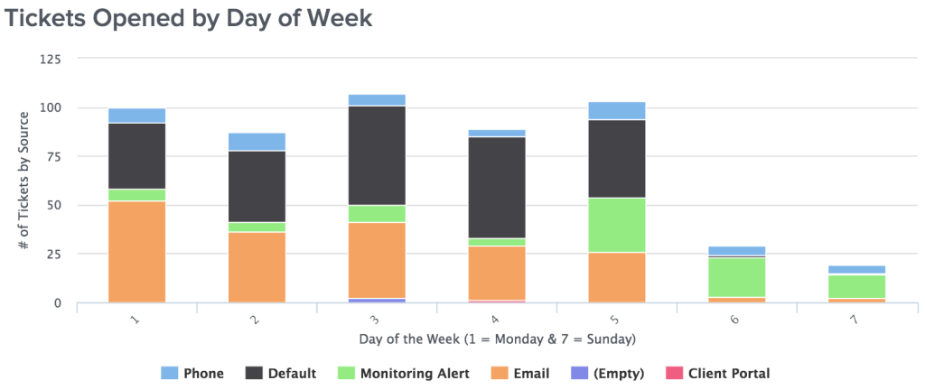
Is Monday the busiest day of the week for your service team? What time should you staff up your service team for peak volume of tickets? During those peak times, where are these requests coming from? These are just some of the questions that we can now easily answer with two of our brand new default gauges of Tickets By Day of Week and Tickets By Hour of Day which we discuss in more detail below. With a quick glance you can see the trend of tickets being created on a daily basis. Although Mondays may seem like the busiest day, you can see from the gauge above that Wednesday is the peak day and Friday also happens to be a high volume day. By adding the additional dimension of the Ticket Source to this gauge you can get much more visibility into where the tickets are coming from each day. The natural next question after being able to see the tickets per day is “when are they coming in throughout the day?” From the example above you can see that there tends to be a gradual increase in the morning until the main peak just before lunch. For the remainder of the day it bounces up and down until a significant drop in volume after hours. Having this information, you are able to properly staff your response team for those peak hours. For example, during the 11am (pre-lunch) rush it might be best to have an extra resource or two log into the ticketing system and help the volume. Of course if you don’t need to see the Ticket Sources throughout the day you can quickly remove them from the gauge, but given the valuable insights it provides we have included it in our defaults. Have you started using these new gauges yet? Share with us how your team has improved operations based on the data found in Tickets by Day of Week and Tickets Opened by Hour!

As a CEO of a software business with customers all over the world, one of our biggest lead sources are conferences or trade shows. They also happen to be one of the most expensive channels for marketing with shows costing $5,000 - $20,000 to sponsor plus the expenses to travel, ship gear and the time out of the office. I overhead one vendor at the last conference I attended say he thinks we’re in a “conference bubble” as the pricing is getting so high it’s almost cost prohibitive. That may be true but here’s how I like to look at conferences and the ROI: 1 - Marketing Opportunity - There is no doubt that having conversations with prospective customers is of tremendous value. The investment in the conference is worth the marketing if you can have enough conversations that turn into customers. So how do you figure out if it’s a good investment? Keep reading... 2 - Visit with Customers - Because our customers are all across the globe it’s too costly for us to get together face to face with each of them. We’ve hosted Meetups in different cities like London last year and this year, Miami earlier this year, and New York before that and it’s been beneficial. So any time our customers come together in one place (usually for a conference) it’s a phenomenal opportunity to see them face to face. 3 - Churn Prevention - Inevitability during a conference we’ll speak with a handful of customers that are not 100% happy or are dormant customers not really using our software. Once we identify those customers, we immediately want to make sure we get them in contact with our team and back on track. I really respect those that are upfront and say they aren’t happy, because they typically give us an opportunity to make things right. 4 - Hear About Market Trends - I love the opportunity to have multiple conversations with customers and learn what’s top of mind for them. What’s keeping them up at night and is there anything I can do to help with it? This is a great driver for our educational webinar series and how we came up with the last two on How Customer Success Drove Our MSP Growth and Best Practices of Client Reporting. 5 - Show Off New Features / Integrations - It brings me great joy to meet customers face to face at our booth and show off the new stuff we have recently released. That always jump starts a conversation and gives us an opportunity to make sure they are happy with BrightGauge. 6 - Hit the Road with my Team - The BrightGauge Team always has a good time on the road. Usually it’s me on the road with my road warrior partner (and Director of Sales) Larry Garcia and after a dozen conferences we have the process down and know how to make the most of our time together. From the list above, only #1 and maybe #3 can mathematically impact a ROI calculation. For the others, they are “soft benefits” and if I had to reproduce the customer contact by flying to each city it’s a no brainer to sponsor conferences. So it’s not a simple question to answer about whether conferences are “worth it”. However, I want explain how the actual financial formula we use works in case it can be a resource for you... Marketing ROI for Conferences For SaaS companies reading this that are interested in learning about the ROI of conferences, you’re going to need the following input numbers: Sign Ups from Conference - You need a way to associate a sign up to someone you met/closed at the conference. This could be manual or you could use a unique coupon code. Average Sale Price (ASP) - When you take your monthly revenue and divide it by the number of customers you have, that is your ASP or sometimes you’ll see it as ARPU which stands for Average Revenue Per Unit. Churn Rate - This has many ways to be calculated but it’s basically the percentage of customers that are leaving you every month. The easiest way to calculate is to take the number of Customers that canceled during the month and divide by the number of Customers you had at the beginning of the month. Gross Margin - Revenue minus your Cost of Goods Sold (COGS). Life Time Value - The formula for this includes your ASP divided by your Churn Rate multiplied times your Gross Margin % or ASP / Churn Rate x Gross Margin % = LTV Conference Expense - The total expenses for the conference which includes the sponsorship and all expenses at the conference (hotel, travel, meals & entertainment, booth gear, etc). For this exercise, this is also your Customer Acquisition Cost (CAC) LTV to CAC Ratio Target - SaaS best practices say your LTV should be at least 3x greater than CAC (which translate to a 33% CAC). However, at BrightGauge we target 5x to try and keep CAC 20% of our LTV. From here, the formula to calculate your ROI is simple: So to identify how many sign ups you need at a conference, you can use this basic formula: Let’s put this into practice with actual numbers of: 5 = LTV to CAC Ratio $8,000 = Conference Expenses $4,000 = LTV That's it! Now you're able to determine if those conferences make sense from a numbers perspective.

We recently announced that with our largest team to date in place at BrightGauge headquarters, we will be upgrading our office space to accommodate our growing crew. With 12 employees and more coming soon, our current 1400 sq ft space is pinched to say the least. Since our team is an incredibly close group, we wanted to continue making sure that they enjoy the space where they spend the majority of their working time, and with that in mind Brian and I went on the hunt for a new home that fits our space needs and our culture. Let me back up for a minute and explain how we got to where we are today. The prior two office leases we had signed were 1 year terms. The first lease was 1 year because we wanted to confirm the idea of being based in Coral Gables so we didn’t want to commit long term. Then our current lease was signed for 1 year because we weren’t sure how much space we would need as we grew. We were focused on getting our migration done and building our product so we didn’t want to lock ourselves in long term until we were sure. However, now as our lease was coming due we took some time to plan things out and factor in where we were going and how many people we were going to need to get there. We love Coral Gables so with a definite location in mind and a team nearly doubled in size, we knew what square footage we needed for the next few years. So we went to work on finding the right space for us. As we started our search we took inventory of the buildings that had between 2,200 and 2,600 sq ft available for 3 year lease. We love our current building so when we heard there were several spots available we decided to focus there. And low and behold the suite right next door to us is available and fits everything we need. Now that we had the space, we brought in the expert Gigi Alvarez to help us design the space and we are excited to share what she came up with! Open Office Layout We have decided to make the new office pretty much wide open except for 1 office and 1 conference room, both with glass doors to still give a transparent feel. Our culture is one focused on being a team and being open with each other so it’s critical to have the walls down (physically and metaphorically). So the new office space will allow us all to collaborate more and be able listen and share information faster. Growth Team Our Growth Team will all sit together which ensures that our Marketing, Sales, Customer Success and Data Customization Teams are within earshot of each other and are able to co-produce projects together. Having the team close by makes it easy for those quick conversations and everyone is listening to customer conversations so people can pitch in when necessary. Product Team The Product Team needs to sit very close to one another because they are constantly working on projects together. So we wanted to have a design that would maximize the ease to share but not have people sitting on top of each other. The other cool thing about the Product Team area is that they are now sitting right by the window. In the current space they are off in the dark (usually with the lights off, by choice) but now they’ll have a nice dose of regular sunlight to brighten up their day. Collaboration Area The most anticipated part of the office is by far the collaboration area. This is where we are getting the most input from the team on what to do with the space. From a business standpoint this is where we will get together for our Rambo Pizza meetings and group sync sessions. Because we so often partner up across teams it’s important to have a shared space where we can work together. Additionally it serves as a great spot for us to kick back and relax after a long week or to celebrate a big customer victory. Stay tuned, as we’re really excited to share more as our new HQ comes together!

When it comes to providing client reporting based on the information from your RMM tool (Kaseya, LabTech, MaxFocus, or N-Able) there are countless options. The first step is to identify who your target recipient of the report is, and then work backwards to the type of information you should include in the report. The typical small to medium business owner or executive may not want all the techie “speeds and feeds” details that typically come out of the template reports provided by the vendor. So just like our research for the perfect PSA report, we set out to build the right template. We used three techniques: (1) analyzed the reports our power users of the client reporting feature are using (2) surveyed our customers (3) leveraged our own experience from our MSP What came of this 2 month long research project are our Client Reporting Templates we have shared with all customers. But it’s important to note that these are a “starting point” to help you get going. From here you can build more customization or make adjustments as you see fit. For our RMM data sources (Kaseya, LabTech, MaxFocus, and N-Able) we focused on just a few simple gauges: Device Counts - You would be surprised how many business owners don’t know the number of devices they have on their network. Many of our customers are still pricing their solution by device count so this allows you to keep the count fresh in their mind. Top 25 Most Installed Applications - Standardization of the applications on your client’s network should be a top priority and more importantly, being specific on the types of applications you do not support. This gauge provides an easy visual to start the conversation about the applications running on the network. Server Patch & Server Antivirus Protection (AV) - Given the world we live in now with security threats popping up every day, ensuring your client’s servers are properly patched and secure with antivirus is a requirement of every MSP out there. With our patch and antivirus gauges it’s easy to see if everything is properly secure. Server Disk Utilization - Understanding the space available on your client’s critical servers is important to ensure that all the servers are running properly. A key disk drive that gets full can bring down the server so keeping your clients updated on the trend is critical. Workstation Patch & Workstation Security (AV) - Keeping your client’s end points properly patched and antivirus updated is a difficult challenge. Unlike Servers that tend to stay put and always on, workstations can be on the road and not connect to the network for days at a time - and when they are connected, they may be powered off during the patch window. Tracking the progress of your client’s patch and antivirus is very important to ensure their network is safe. Workstation Disk Utilization - Space on a workstation is not as critical as servers but it does provide early indications on which workstations may need to be upgraded. This helps to avoid end user downtime and is also a potential upselling opportunity. In summary, with these key gauges you are off to a great start to show your clients: (1) what they have on their network (2) how secure the devices are on their network and (3) identify which devices may need to be upgraded. This summary speaks volume about the value you are providing! To learn more about how you can ensure client happiness and save a ton of time by skipping the manual report process, check out our free webinar:

Recently we’ve talked a lot about Customer Success (check out our webinar on the topic here) and how our partners can benefit from implementing their own program. The topic has been very popular with our community, so we decided to bring in a local expert with years of experience in building, launching and maintaining a Customer Success program. Jorge Azcuy, Managing Director of All Covered in Miami joined our co-Founder and CEO, Eric Dosal to discuss how and why Technical Account Managers (TAMs) were used as the foundation for the Customer Success program he managed at Compuquip. Kicking off Episode 4 of The BrightGauge Podcast Whether you know them as Project Managers, Client Advocates, Client Experience Reps or by any other name - TAMs have proven to be an integral part of ensuring happy customers in the world of Managed Services. During this episode, Jorge and Eric chat about everything related to launching their Customer Success Program with TAMs and how to integrate them within your service team. From initial onboarding, to developing and utilizing Semi-Annual Business Reviews to project management advice, compensation and incentives for TAMs and even how to handle tension between TAMs and the service delivery team, Jorge and Eric cover everything you need to know. Leveraging Technical Account Managers to Ensure Customer Success: Episode Highlights How All Covered structures territories and responsibilities (1:40) A day in the life of a nation-wide service provider (3:26) Management tools & processes (4:57) Customer Survey process (5:51) The role of Technical Account Manager (TAM) at Compuquip (6:29) The benefits of implementing an onboarding process (8:34) Managing tension between the service delivery team and TAMs (10:35) A closer look at TAMs (11:45) The purpose of a Semi-Annual Business Reviews (SABR) (14:44) Project Management (16:54) Compensation and Incentives (18:04) Staying connected to the growing team as CEO (19:40) Q&A: favorite books, professional goals, biggest victory, self-improvement and more (22:22) Episode 4 Resources: Now, Discover Your Strengths by Marcus Buckingham and Donald O. Clifton Drive: The Surprising Truth about What Motivates Us by Daniel Pink The Advantage: Why Organizational Health Trumps Everything Else in Business by Patrick Lencioni As mentioned in the episode, Jorge can be reached at jazcuy [at] allcovered [dot] com. Want to find out more about The BrightGauge Podcast? Check out all the episodes here.

I’ve written before about two of my favorite gauges being Number of Open Tickets and Closed Tickets in a given time period. You can derive so much information from these simple metrics which I go in depth about here. I’m excited to share that now with our Calculated Metrics release we are able to combine those metrics into a more meaningful gauge that we call the Kill Rate. The formula for the Kill Rate gauge is Tickets Closed divided by Tickets Open over the same time period, usually per day. Anything above 100% means you have killed (completed) more tickets than have been opened. Let’s put this to the test:Scenario #1, it’s Friday and your service team is kicking butt and have a big catch up day of closing 50 tickets when there were 40 tickets opened by your customers. The formula to calculate the kill rate is: In Scenario #2, it’s a Monday and the team is getting flooded with tickets from the weekend so 65 tickets are opened by customers and your team is only able to complete 45 of them. The formula to calculate the kill rate is: The beauty of this metric is one number brings a lot of information and in a quick glance you can see how your Service Team is performing. The goal is always to be reducing your service backlog (closing more tickets than are opened) which means you can target your team to keep the Kill Rate above 100%. It even helps to put an incentive in place if they stay above 100% for a certain number of days in a row, meaning they can go out and celebrate. In the meantime, to learn how you can Improve Your Business with KPIs on Dashboards check out our free white paper:


