New in BrightGauge: The Release of Report Filters + Reordering of Gauge Layers

At BrightGauge, we solve around 1,500 support tickets a month! While most of those conversations are general how-to's and helping new customers get off the ground, many of them result in requests for new features and updates to existing ones.
Like any product team, these feature requests get added to our backlog and they can really stack up over time! The more important ones though bubble up as more customers chime in or once they become a deal-breaker in being able to use BrightGauge.
Our latest release answers a couple of these much needed updates, with a boost to report and dashboard filtering too.
Report Filters
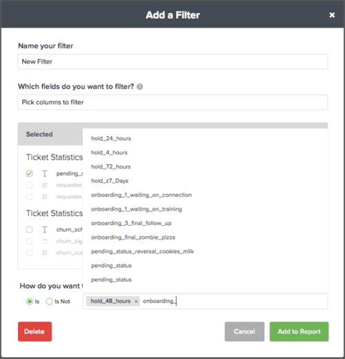
You’ve been using dashboard and gauge filters for as long as you can remember. The many requests to bring this solution to reports have been heard. Now, we bring you the ability to customize your reports with filters too.
Our Solution
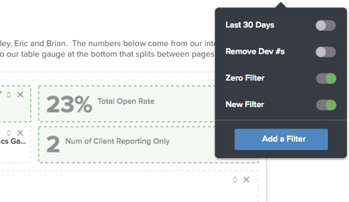
In this release, we allow users to filter Report gauges the same as they would via Dashboard filters. To provide a consistent experience with adding, editing and deleting filters, we’ve made additional improvements to the existing dashboard filters menu along with the ability to carry over existing filters to a report.
Tip: Filters currently don’t save in report templates. If you want to apply filters used in a previous report, simply copy the report that’s already been sent out and modify from there.
Moveable Layers
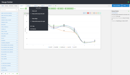
We admit, the inability to reorder layers was a UX fail on our part to not include this until now. This became most obvious when working in a gauge with more than two layers present, specifically in any chart or table. Before, if you wanted to rearrange the order of your gauge layers, you’d have to to delete or edit all subsequent layers to modify the order.
Our Solution
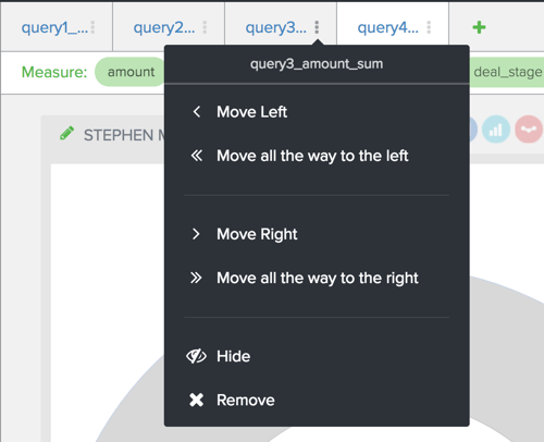
Simple, yet effective, you now have the option to quickly sort gauge layers via a dropdown. The option to sort will only appear if you have more than one layer present. To move a layer to the left or the right of another layer, click that gauge layer’s menu and select the positioning from the dropdown. Once you’ve changed the order of your layers, you’ll notice the appearance of your charts will change as well.
Tip: For further modification, work with the Design panel to change colors & thresholds, axis configurations, plus other formatting options.
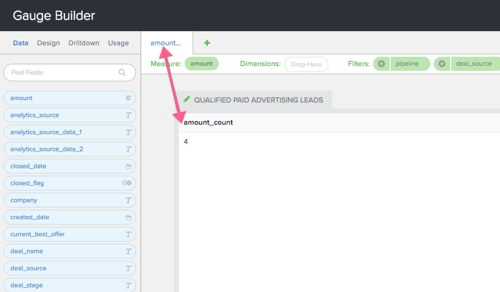
When checking this out, you may also notice that our gauge column tab names now also match the name that appears in the corresponding layer. Easier identification for the win!
Read our latest post on the importance of everyone in your team getting to spend time in the support queue.
Free MSA Template
Whether you’re planning your first managed services agreement, or you’re ready to overhaul your existing version, we've got you covered!


