Blog Logo-2.svg

The BrightGauge Blog

Why You Need Free, Unlimited Dashboards & Reports

I must have missed a memo or something. Since when did people start thinking it’s okay to pay for business intelligence that limits the number of dashboards and reports they can create? That’s like ...
I must have missed a memo or something. Since when did people start thinking it’s okay to pay for business intelligence that limits the number of dashboards and reports they can create? That’s like paying for Microsoft Office and then finding out that you can only create 5 documents or spreadsheets a month with it. It’s your data and you should be able to consume it however you want! At least, that’s what we think at BrightGauge, which is why we don’t limit the number of dashboards and reports that you can create. Here’s why you need to have unlimited dashboards and reports: The Benefits of Unlimited Dashboards and Reports There are two primary benefits to having unlimited dashboards and reports: Scalability and the ability to share reports with each and every client. But, to say those are the only benefits is a bit premature. Let’s look at these benefits one by one: Scalability As your organization grows, you’ll need to have more dashboards and reports as new departments are formed, managers and execs are brought on, and staff as a whole increased. If you were limited in the number of dashboards you could create, you'd be unknowingly creating a data dictatorship! If you had unlimited dashboards instead, you’d be able to keep your data democratized as your business grows. We’ve talked about data democratization before, but we can’t stress how important it is! Data democratization allows you to increase transparency, enable your managers and employees to make better decisions and motivate good behaviors in your company as employees see how their work impacts the business. Sharing Reports with Clients The ability to share reports with each of your clients may not seem like a big deal at first, but what if I told you it could increase your bottom line? I bet you’re interested now! Sharing reports with clients will build trust, which, in turn, increases satisfaction and then lowers churn. In addition to increasing client satisfaction and decreasing churn, client reporting paves the way for higher paying clients as it shows them that you are meeting and exceeding SLAs on a consistent basis (which you should be doing if you’re a data driven MSP). Free Your Data Our competitors insist on putting limits to how often you can access your data and make you pay to share it with viewers, but we put you first, and because of that, we won’t charge you extra for creating or sharing new reports and dashboards. If you’re ready to experience the benefits of unlimited dashboards and reports, let us show you how to liberate your data with BrightGauge!
request-a-brightgauge-demo

Choosing the Most Powerful KPIs for Your Organization

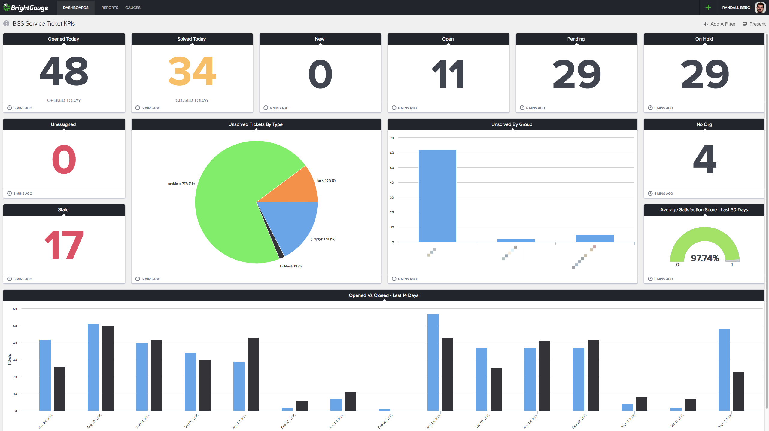
If you are looking to improve the performance of your organization as well as the individuals within it then you will benefit by using key performance indicators (KPIs). Key performance indicators allow you to: Increase productivity. You don’t want people doing busy work or focused on the wrong things. Establishing KPIs allows you to determine whether your team is working toward the right goals and what adjustments need to occur to keep productivity high. Improve performance. KPI metrics provide a measuring tool for determining if employees are performing at the level expected for their role within the organization, while assisting the company in reaching its strategic objectives. Make better decisions. Choosing the appropriate actions to take depends on the goals you want to reach. KPIs help reduce uncertainty by providing a basis for determining which decisions will lead you in the right direction. To achieve these benefits you must choose the right KPIs, which is something that doesn’t come easily. Here is the BrightGauge Guide to choosing KPIs: An Overview of KPIs Many wonder what the differences between a KPI and a regular metric are. It can be difficult to tell the difference, especially when you realize how closely the two are related. Every KPI is a metric, and every metric has the opportunity to be a KPI (for the right company). So what’s the key to identifying your organization's KPIs? First, for it to be a key indicator, it must be critical and relevant to the organization’s success. As this Industry Week article suggests, KPIs should measure performance toward the strategic objectives that you’ve laid out as part of your organization’s performance plan. It is absolutely critical that these KPIs measure the most important factors in achieving your success. Stay away from the minutia. Next, KPIs must be quantifiable, controllable, and repeatable. If team members cannot influence the outcome, you’ll find it difficult to gain their buy-in. Selected KPIs might include improved customer service response rate, increased revenue from the sales team, or a decrease in past due receivables. A key indicator means the outcome or expectations are measurable. KPIs are a gauge. They should have a specific expected outcome that you can track over time. Finally, when it comes to choosing the right KPIs for your organization, consider your main purpose is to determine how to drive business performance. How Many KPIs Should You Have? Well, the short answer is 3, but things are rarely that simple. You’ve got several different departments and people at different management levels who will all be focused on different goals. The real number of KPIs will depend on the size of your business. So instead of just three KPIs, follow the rule of threes. The best way to explain is with a realistic example of a larger organization’s KPIs: Top Level Management: Sales Growth (Net Promoter Score) NPS Employee Engagement Mid Level Management: Sales: Sales Growth Opportunities Sales by Rep Marketing: Sales Growth Marketing Qualified Leads Site Visits Service: NPS Customer Satisfaction (CSAT) Average Time to Acknowledgment HR: Employee Churn Employee Tenure Employee Engagement As you can see, upper level management has 3 KPIs and mid level management has 3 KPIs per department. This doesn’t mean that each department needs 3 unique KPIs, they often will share KPIs like Sales Growth and NPS in the example above. How Often Should You Measure KPIs? There is no universal rule when it comes to how often you check your KPIs. Each metric is different and every company is different, so where one company may check theirs daily, weekly could be sufficient for another. We recommend you don’t go longer than a week without checking KPIs, but feel free to experiment and see what works for your company! We keep ours on a dashboard in the BrightGauge HQ so that anyone on the team can tell with a glance how we are performing: The Service Ticket KPIs dashboard at BrightGauge HQ How Do You Ensure KPIs Will Increase Performance? KPIs will increase performance so long as they meet the following conditions: Are leading, not lagging indicators of performance Reflect areas of the business that impact performance the most Measure metrics that when improved guarantee future success Examples of KPIs that will increase performance are: Churn Rate Sales Growth KPIs that wouldn’t increase performance are: Net Profit Customer Service Awards Won Should KPIs be Directly Controllable and Manageable? Yes… and no. The KPIs you choose should be able to be impacted by the actions of managers and staff, but you don’t want them to have direct control over the metric. A great example of how controllable a KPI should be is Net New Customers. Net New Customers can be impacted by the actions of sales and marketing staff, but short of buying the product themselves, there is no way to directly control the KPI. This forces your staff and management to generate and close more leads, increasing performance. How Should Your KPIs be Visually Displayed? Even if you choose the best KPIs, a lack of visualization tools can hinder your ability to increase your business’s performance. In order to ensure you’ll be increasing performance on all levels you should be displaying your KPIs on dashboards around the office and in reports distributed amongst your team. Our customer, Nucleus Networks, uses dashboards throughout their office to display KPIs Recap on Choosing Your KPIs: KPIs are a useful tool for creating a high-performing culture. They allow you to balance quantitative and qualitative measures to understand desired performance, but in order to achieve these benefits you have to remember to: Follow the rule of threes when determining how many metrics to choose. Measure your KPIs as often as necessary, but no later than weekly. Choose KPIs that increase performance. Choose KPIs that can be impacted by your team, but can’t be directly controlled. Display your KPIs on a dashboard around the office and in reports sent to your team. Need KPI inspiration? Check out 70+ metrics for MSPs, plus their accompanying formulas:

Subscribe to get the latest content delivered to your inbox

How to Use BrightGauge to Stop Losing Sales Quotes

It’s a Tuesday afternoon and you’re burnt out from sending quotes. You’ve been sending out quotes constantly for the last 3 months, but now you realize that you’re wasting your time. You’ve been sending quotes to businesses that you’ll never win. On top of that, you found out last Thursday that you’ve lost a client to a cheaper, local competitor. Sounds familiar, doesn’t it? That’s because this is one of the most common issues that MSPs face, but what if I told you that this time next year, you could be turning down clients instead? If you’re ready to waste less time in sales meetings, win more business, and have clients of such high quality that you’re excited to pick up the phone when they call, here’s what to do: The Importance of Identifying your Ideal Customer One of the biggest mistakes MSPs make is failing to identify their ideal customers. Ultimately, there are 3 types of customers: The customers who are a joy to work with, respect your time and experience, and pay you on time. These are your ideal customers. The customers who are easy enough to deal with, mostly listen to what you and your team say, and almost always pay on time. These are your average customers. The customers who don’t value your advice, nickel and dime you on your quotes and invoices and don’t care to pay you on time (if at all). These are your bad customers. The key to closing more sales quotes is to prioritize selling to your ideal customers and to spot bad customers early enough that you don’t waste any time on them. That’s right, not every customer is the right customer! It’s important to note that the size of the customer and even the amount they will pay you is irrelevant. If they are a bad customer they will waste your time. How to Identify your Ideal Customer with BrightGauge Like many other aspects of business, identifying your ideal customer starts with data. With just 3 gauges, you can begin to identify your ideal customer: Top 10 Tickets per Endpoint Monitoring your top 10 tickets per endpoint will help you identify which customers create disproportionately large amounts of work for your MSP. In the image above, Al’s Coffee Shop is submitting 500 tickets, and you may be tempted to put them into the bad customer category, but you’ve got to dig a little deeper before jumping to conclusions. Say you have a customer with 1000 users and they submit 500 tickets. That breaks down to 2 end users per ticket, which is probably pretty profitable for you! Now let’s say you’ve also got a customer with 100 users who submits 200 tickets. That breaks down to 2 tickets per end user, which is not so profitable! It’s all about finding your sweet spot. Which customers have the best ratio of users to tickets? Lowest 10 Tickets Per Endpoint In addition to monitoring top 10 tickets per endpoint, you should take a look at your lowest 10 tickets per endpoint. Generally these will be your smaller clients who submit few tickets because they have fewer end users, but you may be surprised to find a few customers who have a large number of users but are in your lowest 10 tickets per endpoint. Spot the customers that are outside of your norm in both good and bad ways. This might be a sign that your team needs to spend more time with them as they might not be calling you for issues if they are off the normal “range” for your sweet spot. Effective Hourly Rate (EHR) Effective Hourly Rate is a metric that many MSPs measure, but few realize its true potential! While it may be tempting to look at your clients with the highest EHR and call those your ideal customers, it’s best to find a balance between EHR, Revenue and Hours. Your highest EHR clients may contribute a very small revenue, for example, and if you tried to only sell to those customers you’d not have enough revenue coming in to survive! At the same time, your highest revenue customer may have a low EHR, in which case pursuing these types of customers would result in very low profit margins. Once you’ve got those 3 gauges set up, you need to create a baseline. Monitor them over the course of at least 3 months and then start grouping customers by category. Create buckets for each type of customer: average, ideal, and bad. Once you’ve done this, take a look at your ideal customers and bad customers. What do the companies within these categories have in common? Here are a few examples of what to look for (but I encourage you to find as many trends as possible): Industry Number of end users Revenue (theirs, not yours) How much they pay you Number of workstations Number of servers Location The source they came from (Referral, Print Ads, Pay Per Click Ads, Blog, etc.) You should begin to identify what your ideal customers have in common. Once you’re armed with this information, you can create a buyer persona which reflects your ideal customer. This is who you will target and sell to. Similarly, you’ll want to look for the trends which your bad customers have in common. Use these to create a list of red flags which indicate that a customer will be a bad fit for your MSP. Avoid these customers like the plague. Once you’ve created those two documents, you can begin selling to the right customers while turning away the bad ones. By doing this you’ll be able to more effectively sell since you know who to be selling to. Learn More by Watching Our Video on the Subject: Taking the Necessary Steps Here are the 6 actionable steps you need to take to ensure you’ll stop losing sales quotes: Track your Top Tickets per Endpoint, Lowest Tickets per Endpoint, and EHR with BrightGauge. Identify customers that have abnormally high or abnormally low EHR and Tickets per Endpoint. Use this data to find your sweet spot (in other words, your ideal customer.) Create a Buyer Persona and a list of Red Flags. Begin to market and sell to your ideal customers more aggressively, while learning to identify red flags early in the sales process so you can turn away bad clients. Profit! Have any tips for growing sales and retaining customers that you didn't see here? Share them in the comments below!

[Podcast] Episode 23 with Kevin Studley of The Network Pro

Making a total transition from traditional break/fix operations into a pure MSP model is a feat that many Service Providers struggle to complete. That’s why we asked Kevin Studley, President & CEO of The Network Pro, to share the highlights of implementing such a large operational change.In addition to changing his service model, Kevin joined a peer group, invested heavily in the Traction operating system, and built a strong sales team to help increase business each year. Listen in for the full conversation on Kevin’s journey. The Results of Adopting a Business Operating System: Episode Highlights Kevin’s introduction and background (0:55) The evolution from traditional break/fix Service Provider to pure-play MSP model (1:35) Areas of focus and a typical day as owner of The Network Pro (6:28) Benefits of adopting the Traction operating system (7:28) Best Practices for meeting format (8:39) The benefits of adopting L10 meetings (9:43) How to get an entire leadership team on board with adopting a new operating system (12:11) How and why Kevin became a member of the TruMethods peer group (16:42) The transformational experience as a peer group member (18:45) The business of numbers: how can MSPs determine if they are a good fit for peer groups (19:45) How Kevin is adding business every year through sales team structure (21:53) How to transition closing power from business owner to sales team (23:56) Talent acquisition: do you train salespeople from the ground up, or find and hire strong players? (27:56) When it comes to being data driven, how do you use BrightGauge? (30:50) Metrics to monitor, coaching opportunities, and more (31:43) Correlating data between tickets, customers, and efficiency (33:28) Rapid-fire Q&A: best business books, how to improve as business owner & executive, hobbies outside of the office, advice for MSP owners/execs, how to reach Kevin (37:03) As referenced in the episode: It’s Your Ship: Management Techniques from the Best Damn Ship in the Navy by Captain D. Michael Abrashoff Delivering Happiness: A Path to Profits, Passion, and Purpose by Tony Hsieh TruMethods peer group Want to find out more about The BrightGauge Podcast? Check out all the episodes here.

How to Increase Sales and Growth with Data Democratization

After reading that data is the key to growing your business, you’ve spent hours every week poring over your sales data so that you can create plans to increase sales performance. You’ve put what you read into practice and are making data driven decisions. An increase in sales and growth must be right around the corner, right? Maybe not. Your Sales Reps still aren’t increasing their numbers and they don’t get it when you try to show them areas where they can improve. As a business owner, one of your biggest priorities is to grow the business by increasing the amount of sales coming in, but so far, you’ve not been able to improve upon your sales performance. So what’s the answer? Data Democratization: The Key to a Well-Performing Sales Team Data democratization, the process of sharing your data with everyone on your team, has the power to increase your sales team's performance by: Enabling sales reps to diagnose their own strengths and weaknesses Improving communication between you and your team, showing them when their actions lead to (or don’t lead to) results Improving your team’s decision making Changing the way your reps sell your product or service Boosting team confidence And more To give you an idea of just how powerful data democratization is, the team at BrightGauge has been able to break sales records and grow larger each year because our sales data is on a dashboard for everyone to see. Here’s how you can achieve similar results: Which Sales Metrics to Share What metrics do you share with your Sales team? Share all relevant and important metrics. For example you may want to share: Month to Date Sales Win Rate Lead Response Time Open Opportunities per Rep Average Deal Size Sales Cycle It’s important that you don’t overwhelm your team with data, so only display a handful of the metrics that matter most. Once you’ve got the precautions in place and you’ve figured out the metrics you want to share, you need to determine how to effectively share your data with your team. The Top Methods for Sharing Data with Your Team There are a couple of methods you could use to share your key metrics, and we will give each a brief overview: A few years ago, the most common method of sharing key metrics with your team was in the form of a weekly meeting. While this still works today, it isn’t the most efficient use of your team's time. Another method is to create reports that you send via email to your team each week. While this doesn’t require your team to be in a meeting each week, it has a little bit of lag time, which means that if a sale closes today, and you don’t send out a report until next week, you may not be sharing fast enough! The last method you could use is a dashboard displayed in a way that your whole team can easily see it. This doesn’t require a significant time investment from you or your team, and is often the go to choice for companies looking to share data with their team. How TUC Managed IT Solutions Increased their Sales with Data Democratization TUC Managed IT Solutions, a BrightGauge power user, has been using dashboards in their office for several years now, and by doing so have increased the number of leads they close. They were also able to cut down on the time spent on admin related tasks, helping their team to focus more on making more sales. They've incorporated some interesting ideas like gamification to create a data driven sales team. Using dashboards, they’ve uncovered new sales opportunities, built customer relationships and more. Learn about the dashboards they use and the tips they give in this webinar recording: Creating Your Own Success Story Becoming data driven on a management level is no longer sufficient. To experience real results, you’ve got to embrace data democracy. Use the tips and tactics we shared in this article and you’ll have a great chance at improving your company’s sales and growth. Take the necessary precautions, share the right metrics, and use a dashboard as I mentioned above. If you have any questions about using data democratization to increase your sales, leave a comment below and we’ll be happy to help!

70+ Metrics for MSPs

Key metrics and accompanying formulas to help MSPs skyrocket growth and success!

Get your KPIs

The Dollar Cost of Not Having (or Cheaping out on) BI Tools

$194,276. That’s the amount it could be costing you each year to skip out on or use cheap and ineffective Business Intelligence (BI) tools. Let’s break down that number and explain why you really can’t afford to be without a good business intelligence solution. Potential Recurring Revenue - $48,000 One of the biggest benefits of using a great dashboard and reporting tool is the ability to identify just how profitable your contracts are. If you’ve ever heard of the Pareto principle, you may not be surprised to find out that 20% of your clients are responsible for 80% of your workload! The toughest part is identifying those clients, but with a gauge set up to display Tickets Per End Point you’ll be able to quickly and easily identify unprofitable clients. In addition to identifying unprofitable contracts, you can use the information to create a report that will help convince them that they need to pay you more for your services. Richard Trivedi, a BrightGauge customer and Owner of CadreNet, was able to increase his monthly recurring revenue (MRR) by over $4,000 a month by identifying these problem clients and then using the reports to raise their rates. He recently joined us on The BrightGauge Podcast and explained how easy it was for him to increase his MRR. The Math: $4,000 multiplied by 12 months gives us a nice yearly increase in revenue of $48,000. Wasted Time - $126,100 Just as a PSA and RMM will pay for themselves by making your team more efficient, having a great dashboard and reporting setup could allow you to save a few, or in some cases a significant amount, of hours per week. This is because you’ll cut down on the time spent on admin related tasks such as producing timesheets and income reports, checking and processing metrics, and running and verifying reports. Before joining us on the podcast, Richard Trivedi was a customer case study with us, and he shared his story of saving 25 hours a week after using our software. The Math: If we multiply 25 hours a week by the global average hourly rate for MSPs ($97) we get a total of $2,425 hours a week. Multiply that by 52 weeks and you’ve got $126,100 a year. Billable Tickets/Hours Lost - $20,176 Most MSPs struggle with lost billable tickets and hours. The amount lost varies by MSP, but in this example, let’s assume an average of 10-15% of billable tickets and hours are lost every week. Most managers and owners attempt to correct the issue by using incentives or even creating additional consequences for not entering all hours, but these methods don’t deliver the best results. A dashboard and reporting solution will ensure that you lose as little hours and tickets as possible, helping to minimize revenue loss. The Math: 10% of a resources time would equate to 4 hours a week. Multiply that by the average hourly rate ($97) and you get $388 dollars a week. Multiply this by 52 weeks and you’ve got a total of $20,176 a year. And that’s just for one resource. Larger MSPs could see a much higher number here! How to Use Dashboards to Increase Your Revenue $194,276 or more could be slipping through your fingers, but you can get it back. Here’s how to use a dashboard and reporting solution to recapture those hard-earned dollars: Start by tracking the right metrics. You’ll want to create a dashboard that displays all the following metrics: Open Tickets by Age - to ensure nothing is slipping through Average Time Spent per Ticket Average Time Spent per Ticket by Technician Top Tickets Per End Point by Client Profit by Client or Device Time Spent per Month by Client and Device Hours by Technician Once you’ve set up a dashboard showing this information you’ll be able to use the data to identify where you need to raise rates, what is taking up your and your technician’s time, and how many tickets/hours are being lost. Armed with that information it will be easy to make decisions that will increase your MSPs profitability, and since you’ve got the data to back the decisions up, you’ll encounter less resistance from clients and employees. If you want to see firsthand how a dashboard can increase your business's profitability, schedule a demo with our sales team.

[Podcast] Episode 21 with Ryan Markel of Take Ctrl

There’s a good chance you’ve heard by now about a handful of different peer groups for the MSP/ITSP industry, and for good reason - they bring results to business leaders. We’ve even featured some conversations on them here before, specifically taking a look at what to expect if you’re considering joining one. This time we asked Ryan Markel, President of Take Ctrl, to join us for a conversation on how he’s grown the IT business he co-Founded, as a direct result of joining the Robin Robins peer group. Ryan shared with us about learning to lean on his new network of like-minded industry leaders, to the business lessons he’s learned, how to face and resolve hiring challenges as a leader, and even how to provide more value to customers by focusing on service. Leveraging Peer Group Resources to Achieve Growth: Episode Highlights Ryan’s intro and background (0:54) A day in the life as President of Take Ctrl: how duties are divided between partners (2:27) The decision to move from break/fix into a MRR model (4:49) Lessons Learned in the Robin Robins peer group (The Producer’s Club) (6:43) What size MSP business joins a peer group? (13:31) Facing the hiring challenge as a MSP leader (14:41) A closer look at Topgrading and how it works (17:12) How Take Ctrl is driving growth each year (21:37) Deciding on the price per user (24:37) Getting to know customers before marketing to them (27:10) New operational abilities that didn’t exist before adopting BrightGauge (30:37) Rapid-fire Q&A: best business book, blogs to follow, parting advice, and how to reach Ryan (36:32) As mentioned in the episode: Books: Scaling Up, by Verne Harnish and The Big Five For Life Continued, by John Strelecky Blogs: Krebs on Security, Seth Godin, Technology Marketing Toolkit An example of Asset Management using BrightGauge, as referenced by Ryan: Want to find out more about The BrightGauge Podcast? Check out all the episodes here.

Why You Need a Vision, Goals, and Metrics (in that Order)

Your priorities are wrong and so are most other businesses’. No, I’m not referring to your work/life balance. I’m talking about how you and other businesses have let metrics become the captain of the ship while your vision is forgotten. Businesses tend to fall into the trap of thinking that metrics should set your goals which in turn create your vision, when it’s actually the other way around! This doesn’t mean being data driven is wrong, it’s a necessity, but most companies go about being data driven in the wrong way. Here’s how to do it the right way: Vision: The Key to Success Even though the term “data driven” would suggest that your data drives your business, you’ll actually want to be driven by your vision. Your vision is why you started your business in the first place. It’s what determines where you’re heading and will determine what you achieve! Your vision is more important than your metrics because metrics can only tell you where you’ve been and how you’re doing. They don’t tell you where you will be going like your vision does. Taking Action First, ensure you have a vision. If you don’t have one, now’s the time to make one. Hint: why did you start your business? Many companies display their metrics with dashboards on TV’s, but few put their vision on the wall like they do their metrics! Be one of the few companies that proudly displays their vision so that your employees know to work towards that vision. Some examples of famous corporate-brand visions: “To offer designer eyewear at a revolutionary price, while leading the way for socially-conscious business.” (Warby Parker) “To create a better everyday life for the many people.” (IKEA) “To bring humanity back to the skies” (JetBlue) Once you’ve got your vision, you can begin to create goals. Goals: Milestones Towards Achieving Your Vision Goals are the smaller chunks that make up your vision broken down into achievable milestones. Ideally, these are in the form of quarterly SMART (Specific, Measurable, Achievable, Realistic, and Time-bound) goals. Each goal that you successfully complete brings you closer to achieving your vision. Taking Action Take the time to create a few SMART goals based on your vision. Unlike a vision which isn’t always measurable, these need to be clearly and quantifiably completed. Here’s a great example of a goal: Based on Warby Parker’s vision (“To offer designer eyewear at a revolutionary price, while leading the way for socially-conscious business.”) we can create the following goal: Lower the price of our glasses to $85 from $95 by the end of Q4. You can have one goal or create multiple goals, just ensure that you don’t lose focus with too many goals! Once you have your goal (or goals) you can move on to discovering your KPIs. Metrics: Making Sure You’re Reaching Your Goals Metrics, and more specifically KPIs, are what you use to ensure you’re on track and will reach your goals and eventually your vision. Contrary to popular belief, your KPIs don’t actually tell you how much progress you’ve made towards a goal. They only indicate your performance. Here are a few other things that metrics can and can’t do: Metrics can: Measure performance Inform decisions Expose opportunities and challenges Metrics cannot: Fix your problems Motivate your staff Run your company Taking Action Your KPIs will be determined by the goals you set, and they should be able to provide the full picture as to how your business is performing. You want to avoid choosing more than 5 KPI’s as it would become too difficult to actually track performance, but choose too few and you won’t have the picture. 3 or 4 KPIs is the sweet spot. Example KPIs: Continuing with the Warby Parker example, if your goal is to lower the cost of glasses here are the metrics you may want to track: Total cost of goods Profit Number of glasses sold Number of glasses returned for quality issues These metrics would allow you to see your cost of goods which tell you how much you could lower the price, profit to ensure your margins are still good, glasses sold to see how the new pricing is affecting sales, and the number of glasses returned for quality reasons - important if you switched to a cheaper material and it’s not holding up as well as previous materials. Conclusion Remember, vision is more important than goals which are more important than your metrics. Get your priorities in order and become data driven by starting with your vision. If you don’t, your business will lose what drives it in the first place.

4 Ways Transparency and Dashboards Go Hand in Hand

Businesses and the leaders within them are using the phrase “need to know” less and instead are beginning to embrace an “everyone should know” mentality. In other words, businesses are adopting the idea of transparency at a rapid pace. There are many reasons as to why transparency has become such a big deal, but one of the largest reasons is the ability to change behavior both in your staff and your customers. If you’re not fully sold on the importance of transparency in business here are a few vital statistics: Transparency increases customer satisfaction by close to 20% (according to an HBR study) It also increases employee efficiency by 13% or more (according to the same HBR study) Transparency is the top factor in determining employee happiness (according to a Tinypulse study) These benefits have led many businesses to look for ways to increase transparency. We often hear from our customers that one of the main benefits to using dashboards is the increase in transparency that they easily provide. Dashboards are one of the best ways to display metrics for tracking performance, and there’s no hiding from those numbers. If something isn’t going well, it shows, and that transparency will help your team to work together to address the issue. The data speaks for itself and creates transparency without a large amount of effort from management. Here are the top 4 reasons our customers love to use dashboards to increase transparency: 1. Your team will be on the same page An important benefit of increased transparency in a company is the ability to ensure your team is working together and with a shared vision. Studies show that when teams are on the same page they feel more confident, put more effort into their work and deliver more predictable work. In order to achieve those benefits, you’ll need to help get them there. You could take the time to meet every day and ensure that everyone is on the same page, but that requires a large portion of time from you and your team. A better way to do this is to put dashboards up around the office on computer or TV monitors. This will result in a quick and easy way to ensure your entire team knows what’s going on and can keep an eye on important metrics. In this scenario, you’ll want to place some of your KPIs on a dashboard in a place where your team can be instantly informed as they walk by. 2. You will align everyone with certain metrics to improve Part of being transparent is keeping your team in the loop and sharing with them key metrics even when the numbers aren’t pretty. One of the benefits of being so open about your business’s metrics is that your team will know when there is a particular area of the business that needs extra attention and will be able to use the data to determine which methods are working and which aren’t. It's proven that tracking key metrics and sharing them will increase the performance of your team when done on a long-term and regular basis. Whether you share in the form of a weekly report or you keep a monitor/TV on at all times for the team to see, you’ll receive great benefits from constantly tracking the metrics that matter most to your operations. 3. You’ll celebrate victories together When you display your data on a dashboard for all to see, you allow your team to know when they have improved a metric. Seeing an objective finally achieved creates a great boost in company morale and brings your team closer together. Think about the last time you worked towards a combined sales goal or customer satisfaction goal and you hit it. Surely you felt a great deal of accomplishment when you knew that you had achieved success in that area! Making your metric transparent and available to everyone not only allows them to experience the same feeling of accomplishment, but it also results in everyone working hard to achieve the goal. 4. You create a little friendly competition In some cases, such as a customer service or sales environment, you can create a little healthy competition by putting everyone’s performance numbers up. This transparency allows team members to see how they compare to their peers and often results in an increase in performance. Our new leaderboard gauge was designed just for this and is a great example of how a dashboard can be used to create competition. You do need to be careful not to create too much competition, but with a little creativity, you can display individual performance numbers while creating team based competition. When creating competition, keep in mind that you want your team to be working together to hit a metric, not working against each other. How we use dashboards at BrightGauge HQ Since we are a dashboard company, it only makes sense that we use dashboards all over our office, and the benefits like an increase in our team’s efficiency, are invaluable. We track all of our customer support work on dashboards and display those on TV monitors around the office so that we can easily see how many tickets are open and also what phase they are in. This allows us to immediately see where we stand and helps to keep the team all on one page. It also helps to shed light on which areas we need to dedicate more resources and time to by aligning the team with metrics to improve. Because the dashboards are up for all to see, we can celebrate when we’ve hit an important metric and it also creates a little bit of competition when our team sees who’s leading in a certain metric. Conclusion Remember, transparency is a powerful tool to change employee behavior, customer interactions and ultimately your company’s bottom line. The easiest and most effective way to increase your transparency around the workplace is to use dashboards to display key metrics. Dashboards are helpful because they: Get everyone on the same page Align your team with key metrics to improve Boost morale when victories are achieved Create a little healthy competition See the other great ways dashboards can be used by checking out the BrightGauge Dashboardery.

Service Management Best Practices [Free Webinar Download]

For our most recent webinar we wanted to feature a closer look at mastering the balance between efficient operations and ensuring customer happiness - a challenge for any SMB, yet a crucial step in the growth process. We asked Nick Olerud, Director of Technology at NetrixIT, to host this special session and share some of the insights that helped to first drive his team to improve and now maintain their performance. In Service Management Best Practices, Nick revealed some of the specific dashboards his team uses every day along with the management techniques that ensure success for Netrix. Some of the topics Nick covered: how to hold your team accountable with metrics and scorecards how he uses dashboards to manage projects and ensure his team is delivering on time using dashboards to manage escalation tickets leveraging BrightGauge to provide transparency to customers via dashboards and so much more! If you missed the live webinar session, you can still access the entire recording, plus the slide deck with Nick’s dashboard examples here:

[Podcast] Episode 19 with Shann Bosnell of CareWorx

As a true Power User of the BrightGauge platform, Shann Bosnell has joined us on multiple occasions to share some of the tools and best practices that helped TUC Managed IT Solutions (now CareWorx) grow exponentially over the last 10 years. This time we take a closer look specifically at the benefits of data-driven sales and service, results using client dashboards, the decision to operate in a vertical instead of a horizontal, and more. The Results of Utilizing Client Dashboards, and Data Driven Sales & Service: Episode Highlights Shann’s intro and a closer look at the evolution of TUC Managed IT Solutions (0:54) The business benefits of operating in a vertical instead of a horizontal (9:03) Advice on mergers and acquisitions: things to consider about your team in the due diligence phase (12:02) Roles and responsibilities as VP of Technology (15:35) Shann’s insights on where the industry is going & what service providers will be facing soon (19:52) Seeing huge growth by focusing on the right customers & MRR (23:32) Where did TUC’s data driven focus come from?... “Project Tangible” (24:10) Getting buy-in from the team on being data driven (27:47) How Shann uses his 3 key dashboards for customers, service, and sales {see them in the BrightGauge webinar on Customer Best Practices} (29:18) How to decide which customers get a dashboard (35:22) Using BrightGauge to uncover sales opportunities (38:39) Wrap up questions: best source of business knowledge, parting advice, how to reach Shann (40:31) Want to find out more about The BrightGauge Podcast? Check out all the episodes here.

Our Latest Content

// Siteimprove tracking