This time of year, MSPs and business owners like you are focusing their attention on new goals that will lead to growth and scalability. Strategies and targets must be reiterated to the team at large ...
This time of year, MSPs and business owners like you are focusing their attention on new goals that will lead to growth and scalability. Strategies and targets must be reiterated to the team at large and carried out throughout the length of the year. But how do you keep your team members aligned and motivated without constantly micromanaging or over communicating? The key is visibility. The power that visibility brings Giving all employees visibility into company goals and hard data sends a message that they are a trusted and integral part of the team. It gives them a sense of ownership and accountability over their work and the part they inevitably will play in helping your organization reach success. Naturally, employee turnover is bound to happen. But employers are keen on keeping their talent on board, especially in an industry like the service industry where knowing a customer’s history makes a big difference in that customer’s loyalty. So, what makes employees stick around? It goes beyond the person liking what they do on a technical level. There’s a great deal of power in feeling valued, indispensable, and in the loop. Many of us have worked for companies where there was a very bureaucratic process and high-level conversations were solely kept behind closed doors. The lack of transparency that comes with that makes employees kind of feel like what they do doesn’t matter since important company information is reserved for just a select few. But when the opposite happens, and every employee is given access to company numbers, revenue, profits, goals, plans for growth and structure, etc., everyone feels like they are actually a part of the story. Team members will be committed and dedicated to getting their job done and hitting company goals because they’ve been shown that they are trusted to do so. Visibility isn’t some thin veil that gives employees a false sense of security. It’s real and it drives employees to feel like their role goes beyond just earning them a paycheck. 3 ways to keep things more visible Employee motivation and retention strategies will vary across companies and will depend on a number of factors like size and structure. That being said, we have a few recommendations that we believe can be applied within any organization to help improve the visibility you’re giving to team members. 1. Give meaningful assignments If you’re a team lead or manager, a portion of your responsibility is to ensure your team is collectively working towards the overall goals of the organization. But, like we said before, who wants to spend all their time micromanaging? Meaningful assignments directly tied to goals inherently reminds employees of the task at hand and motivates them to work for it. Busy, shallow work does little to encourage employees. It’s tedious and unchallenging. But meaningful, purposeful projects serve as a reminder that your team members have a real stake in the company and their productivity will have tangible results. The opportunity to constantly learn and grow - through challenging work - encourages people to be more efficient and autonomous and to just keep improving. 2. Access to executives Few things are as impactful as an executive who makes their presence known on a personal level. We’re talking about CEOs and founders who know the names and roles of everyone working for them, who make it a point to touch base with their employees on a regular basis, who make themselves available to address roadblocks and successes alike, and who simply keep themselves visible. When everyone from the Office Manager to the Director of Sales feels like they are known and seen by the “The Boss”, it’s beyond motivating. Suddenly team members want to do everything in their power to be a valuable team player, so they’re going to go above and beyond to perform well without having to be reminded or asked to do so. We've heard of CEOs who don't have an office and instead choose to use a desk in the middle of the floor, just like everyone else. No office politics there. 3. Make use of business intelligence Data speaks volumes. You can’t argue with hard facts. And you can’t hide behind numbers. Giving every employee access to company data is a huge deal. Show you trust your workforce and they’ll repay the favor big time. However, data is complicated, so how can it best be shared? Through business intelligence dashboards. By using something like BrightGauge, you can display all of your important company KPIs on a single pane of glass and share it with everyone in the company. For example, let’s say your company is really big on sales numbers. Number of new customers, monthly recurring revenue, opportunities in the pipeline, and qualified leads are metrics everyone’s going to care about. If you have TVs around the office that display these metrics on an easy-to-analyze dashboard, then your visibility game is incredibly strong. Something as simple as a gauge that shows how much you’ve met of your MRR goal can be a daily, visual reminder of why team members are doing what they’re doing. They’re all working together to hit a goal and that gauge acts as the nonverbal nudge (peace out, micromanaging). In conclusion Unless there’s a serious productivity problem, there’s really no need to stand over someone’s shoulder and make sure they know why they have to do the work they’re doing. Practicing transparency and visibility is a much more powerful way to motivate employees and drive productivity. Plus, an environment that encourages autonomy and trust breeds employee retention and satisfaction, which bodes well for all parties involved. For more on the importance of transparency (both with clients and employees), check out our webinar, ‘Building Transparency Into Your Business’.

When it comes to annual performance reviews, many managers’ first instinct is to focus on employee’s goal performance. While goal performance should be taken into consideration, it shouldn’t be directly tied to review outcomes. It’s important to realize the purpose and place of goals within your business. Well thought out goals support the larger strategic plan and push companies in the right direction. However - and this is the crucial takeaway here - goals should represent ideal outcomes, NOT basic expectations for the people they include. Basing performance reviews on the completion success of goals can set you, your teams, and your entire business up for failure. In fact, tying performance reviews directly to the completion of goals could have serious negative long-term effects and reduce the impactfulness of future goals. Before we dive deeper into the role goals should play in performance reviews, it helps to have a better understanding of goals in general. What’s the purpose of business goals? Where do you want to be within a specific timeframe? What are the steps that your company, teams, and individual employees need to take to get to that point? Individual goals ultimately add up to a bigger picture. Goals should do 3 things. 1. Measure success Hopefully, any goals you set are following the SMART goals system (Specific, Measurable, Achievable, Relevant, Timely). The ‘measurable’ aspect is critical. A lot of the time, goals are tied to relevant KPIs because KPIs are the most important metric for measuring success. 2. Improve direction When goals are transparent and cohesive, team members are clear on the direction they need to go in. There become a strong rationale and purpose behind the work they are doing. 3. Focus one’s attention In any organization, it’s likely that employees are juggling several important roles. Business goals pull attention back to where it belongs and remind us all of what is most important when things get a little chaotic. Some reasons to avoid tying reviews to goals If goals are meant to measure success and reviews are meant to evaluate an employee’s success, then where’s the disconnect? Well, goal performance is not so black and white. It’s possible to reach a goal and still fall short in other areas of your job. Or, it’s possible to fail to reach a goal but still be a rockstar team member. Goals are meant to set a high bar. If we’re completing 100% of our goals, 100% of the time, is growth even happening? Goals are supposed to be challenging. We’re supposed to always strive for more. But missing a goal doesn’t mean we’ve failed. Punishing someone for not achieving a lofty goal dismisses their productivity and diminishes their motivation to aim high with future goals. If someone were to meet 80% of their goal, wouldn’t that provide more context than just knowing whether the goal had been “completed” or “missed”? Goal difficulty is subjective. You hired each person on your team for a different reason. Each brings something unique to the table. And each works in a completely different way. Performance reviews should level the playing field between employees by evaluating the areas in which they excel and the areas in which they can improve. But this will carry a different meaning with each team member. The person’s experience, role, background, effort, time with the company, working style, overall job responsibilities, and projects should be taken into account more than whether or not the goal was completed. Goals may have group components. A lot of companies set 3 types of goals: organizational, team, and individual. So, the ability to complete a goal almost always relies on other moving parts within the company. An outbound sales rep may have a goal of closing 10 new sales in a given period, but their role may not require them to engage in lead generation. In this instance, that rep is relying on someone else to bring in a stream of new leads. Their ability to complete their goal doesn’t rest entirely in their own hands. A performance review should carefully look at the role each team member plays instead of just focusing on the end result. The role goals play in performance reviews At the end of the day, there’s a reason why a goal was chosen, so there’s nothing wrong with discussing it during a review. There can be constructive conversations around why a goal was or wasn’t reached and what can be changed in the future to improve upon goal-setting. Ultimately, the result of the goal is not as important as the job performance towards reaching that goal. Performance reviews should highlight improvement in goals. Let’s talk about our outbound sales rep who had the goal of closing 10 new sales. Instead, she closed 8. In the previous period, she had only closed 5. If goal success were the defining factor here, it would be considered a failure and result in a negative review. That’s an unfair assessment. In reality, this rep met 80% of her goal versus just 50% in the previous period. That’s a significant improvement that should be addressed positively. Of course, there’s room to discuss why 100% of the goal was not met and what can be done to improve even further in the next period. Focus on the bigger picture and reward productivity that leads individuals and companies in the right direction. And remember, if goals were easy to achieve, they wouldn’t actually be goals. Performance reviews should focus on positives and negatives. Imagine being an employee who has spent a year busting it in every aspect of their job. They walk into their performance review feeling good, then hear, “You failed to meet your goals; you did this wrong, you fell short here…” Totally demoralizing. What about that hard work that was put in day in and day out? That’s being completely overlooked based on whether or not a goal was completed? Performance reviews should highlight areas where the team member improved, showed increased effort, or had positive results. The missed goal should be addressed to understand contributing factors or see what can be done - as a team or an organization - to be more effective the next time around. Team members should walk out of a review with clear expectations, areas for improvement, and ideas for growth. Performance reviews should be a two-way conversation. Let’s face it - reviews are scary. Even the most experienced professional will get nervous before a review because annual assessments play a huge role in their future with the company. So, why not create a positive, encouraging atmosphere? The reviewer should be constructive: provide praise, concerns, and specific examples of performance (metrics are key here). On the flip side, employees should be given a safe space to provide their own insights. Did they run into obstacles because of organizational structure? Was there a shift in strategy that affected the ability to meet a goal? Did serious personal issues come into play? Was team support less available than it should have been? When reviews focus on the positive, it can be quite empowering. Goals should represent ideal outcomes, not expectations What is the ideal situation you picture for your company one year from now? Goals should motivate teams to try really hard to reach that. But by using that outcome as the defining factor in reviews, you misconstrue what makes goal-setting effective for all organizations. They cease to become goals and instead become expectations. As a result, your teams will set increasingly less aspirational goals to help ensure they get positive reviews. Use goals as a way to highlight improvement and gain insight into strategy. Your teams should come out of their review with fresh ideas for exciting new goals, not with anxiety about previous goal performance. For more on goal-setting and how BrightGauge can help you track goals, download our free whitepaper ‘The Right Way to Set Business Goals’.

As a Customer Service Manager, your goal is to increase client satisfaction, but it can be difficult, impossible even, to improve your client's happiness without utilizing data. One of the toughest parts of using data, is knowing what data to use in the first place! If you’re measuring the wrong metrics on your customer service dashboard, you may be tricking yourself into thinking that your team is working efficiently, your clients are satisfied and your goals met. That’s why it’s so important to be tracking the correct metrics. By using one of our best practice templates when setting up your dashboard, you can ensure that you have all of the gauges that are necessary for service success. Let’s take a closer look: 1. Tickets Opened Today By monitoring the number of tickets opened today, you can know within seconds how big of a workload your team has. This data allows you to ensure you have enough staff to handle the incoming tickets and can help you identify and react when something happens that causes the number of support tickets to spike. 2. Tickets Closed Today This metric gives you an idea of how efficiently your team is performing. If the number of tickets closed today isn’t consistently keeping up with the number of tickets opened, you may need to consider hiring more staff or changing some workplace practices to increase team performance. 3. New Tickets Important for tracking SLAs, the number of new tickets allows you to see how many tickets are waiting to be assigned. These are tickets that haven’t even been looked at by a technician, and if you’re following best practices this number should aim to be 0 at all times. If you notice that this number isn’t at zero your average time to response is increasing and you need to address it! 4. Assigned Tickets Assigned tickets are the tickets that have been responded to and are already assigned to a technician. These tickets are sitting in the person’s queue and serve as another indication of how you are doing in terms of your SLAs. If the number of assigned tickets is too high, then your average time to resolution plan is increasing. 5. In Progress Tickets If you monitor the number of tickets that are currently in progress, you’re actually checking the performance in relation to another key metric: average time to resolution. The number of tickets in progress also gives a good indication of how well your team is performing. 6. Resolved Tickets Resolved Tickets is the last metric that contributes to your SLAs. In most cases, this is the best of the SLA metrics for measuring performance. This indicates the number of tickets your team has resolved today. 7. Unassigned Tickets With unassigned tickets you start measuring the metrics that will allow you to manage by exception. Ideally, this number is always at 0. If there are unassigned tickets, you’ve got a problem because if a customer responds, no one will see the ticket and it will go unresolved. This allows you to quickly identify one of these situations before it occurs! 8. Customer Responded Tickets This is another metric you’ll always want to be at 0, because if not, it means the customer has sent a response, but your team has not yet seen the reply. Ideally you’ll always send the last word as it contributes to a pleasant customer experience. Tracking this number allows you to see when that’s not happening, giving you the power to look into why your team isn’t responding to your clients. 9. Waiting on Customer Tickets By tracking tickets that are waiting on a customer response, you are able to follow up with what could be a potential issue. Typically, tickets fall into this category when a customer hasn’t responded in over 3 days. It could be a sign that they didn’t receive the response or maybe they are on vacation and you need to reach out a second time. Either way, this allows you to know when it’s time to follow up on tickets. 10. Tickets Past Due Tickets that are past due typically have a certain time and date assigned to them, and for whatever reason they were not resolved during that window of time. This could be a result of a ticket that has been resolved but isn’t marked properly, or it could be a true case where the work hasn’t been performed on time. Either way a great indicator of tickets that need immediate attention and may require resetting expectations with the client. 11. Currently Open Tickets by Type Usually presented in the form of a pie chart, currently open tickets by type will show you areas where your team may be struggling and will need to focus on. It also allows you to identify trends that contribute towards the number of tickets being submitted, allowing you to create a strategy to cut down on the number of tickets you are receiving. 12. Stale Tickets Stale tickets are tickets that haven’t been updated in 7 days. This metric is both a manage by exception metric and a compliance metric. This number should be at 0 at all times. Best practices say that a ticket should be updated within 7 days at the latest, so if you’ve got stale tickets you need to find out why and how you can stop them. 13. Average Time to Respond - Last 14 Days Average time to respond is the amount of time it takes to go from new to assigned. The lower the better - if you’ve got a high number here, finding out why should be a priority. 14. Average Time to Resolution Plan Your average time to resolution plan is the amount of time it takes for your team to start working on the ticket (In Progress status). If this number is high, it’s possible that your technicians have too many tickets in their backlog and they need an extra hand. Typical best in class companies aim to keep this number under 4 Hours. 15. Average Time to Resolution Average time to resolution shows how long it takes for a ticket to get resolved. This provides insight into how quickly your team is solving problems. Typical best in class companies aim to keep this number under 8 hours indicating that on average all issues will be resolved “same day”. 16. Tickets Opened and Closed - Last 14 Days An overview of your tickets opened and closed in the last 14 days allows you to quickly see whether you’re ahead or behind. It also allows you to check for trends such as days where your team is not as efficient, or days when abnormally large amounts of tickets are submitted. What’s Next? Now that you know 16 metrics for your Service Management dashboard, keep the momentum going with Dashboard Best Practices: a webinar recording of the fundamentals that we see our most successful customers using to drive efficiency with data! You’ll learn: Top 5 rules for designing dashboards Most popular dashboards for Service, Sales, Management, and Finance Building the right client dashboard Driving competition the right way Management by exception Increasing transparency & efficiency About dashboard features: rotation, filtering, etc. and much more!

Advice relating to good business practices can be endless (and beneficial). Determining what makes one business successful over another is not always black and white. But there’s one rule of thumb that everyone can seem to agree on: trust and transparency are key when it comes to maintaining long-term relationships that are a pillar for success. It’s really quite simple to understand. If clients trust you, then they’ll stick with you and they’ll tell other people about you, which means you’ll gain more and better business, which means more cash will be flowing in. There are many ways to build up trust, and it all comes down to being reliable and consistent. Build trust by sending out executive client reports As an MSP, your clients are paying you for specific and really important services. When an SLA was signed, the client gave you their trust in exchange for your word. But that sort of blind trust is not sustainable. Now it’s on you to prove your worth and show that you’re true to your word. That is precisely what client reports help you do. When you send reports to clients, you are literally showing how you are or are not meeting your SLA points. Since they report on both the good and the bad, reports make you really transparent. You’re not hiding behind anything and you’re not skirting the truth. Think about how good and credible this makes you look. But we’ve heard from many peers in our industry that MSPs are shying away from sending regular reports simply because they are incredibly time-consuming and complicated to create. Typically, creating custom reports involves pulling data from whatever PSA, RMM, or other tool you’re using, spitting that data into an Excel spreadsheet, creating pivot tables and complex formulas, digging for the results you’re looking for, and then converting those results into digestible charts. We know from experience that this can eat up 8 to 10 hours a week. The importance of reports is clear but dedicating a full workday to creating them is not a very efficient use of time. The loss of productivity that comes with focusing on that versus revenue-generating tasks can end up harming your business in the end. BrightGauge solves the client reporting dilemma Creating custom executive client reports doesn’t have to be painful and it doesn’t have to mean sacrificing other areas of your business. With BrightGauge, it takes just a few minutes to generate powerful reports that are custom, interactive, and automated. If you’re worried about what exactly to include in your reports, you can start by using one of our pre-built templates. Whether you integrate with ConnectWise Manage, QuickBooks, Veeam, Webroot, IT Glue, or any of our datasources, we offer default templates that are automatically available in your account. Templates can still be customized to your preference. Regardless of if you choose to start from scratch or use a pre-built, you can save your report as a template and schedule it to go out automatically on the date and time you choose, to the recipients you want. What used to take 10 hours a week now takes a couple of minutes. Even better, the payoff is huge because clients can rest easy knowing a comprehensive report will be delivered to their inboxes on a consistent basis. As you look towards the future of your MSP, consider implementing this solid business practice. Don’t be surprised if your churn rate starts improving. Want to see BrightGauge reports, dashboards, and gauges in action? Contact us today to schedule a live one-on-one demo.

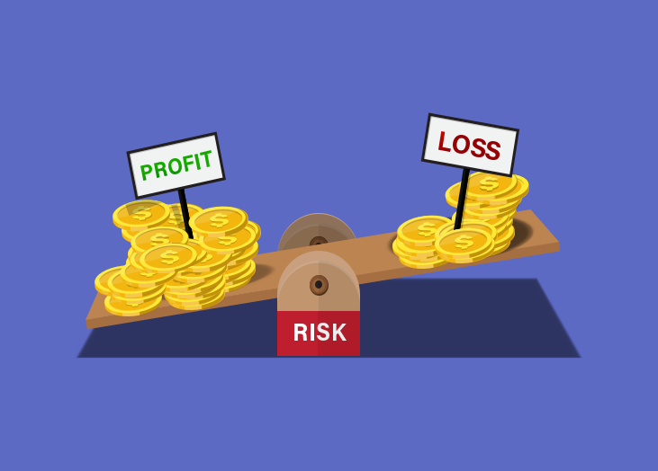
Metrics are powerful tools for determining how successful you are in improving aspects of your business, but unfortunately, they can also lead you astray and cause you to make decisions that have a negative impact. The most successful MSPs know this and have learned to take the following 4 steps in order to avoid making poor business decisions: 1. Start with a Goal Which came first: The Metric or the Goal? This is something that often stumps business owners, but it’s important to remember that metrics are used for measuring things, not setting goals. A metric should be based on a goal, not the other way around. Let’s look at an example: Say your goal is to increase your profit. The top MSPs will create a set of 1-4 metrics (per goal) to measure whether they’re achieving success (which in this case would be increased profitability). In this example, you’d want to use the following metrics: Operating Profit Cost of Goods Number of New Clients a Month This step really is as simple as choosing metrics that measure how you’re reaching your goals, but you could still be making bad decisions if you haven’t completed all of the steps on this list. 2. Understand Vanity Metrics vs. Useful Metrics One of the biggest reasons MSPs make poor decisions is because they are not familiar with the difference between vanity metrics and useful metrics. What is a Vanity Metric? Vanity metrics are metrics that sound good, and make you feel good, but don’t give clear information as to where your company stands. Here are some examples of vanity metrics with explanations: Website Traffic - While many, many companies track this metric, it doesn’t actually give you useful information. There could be any number of reasons your traffic increases or decreases! Followers on Social Media - This metric is similar to website traffic so you won’t know the reasons behind the increase or decrease - reasons that are (arguably) more important than the total number of followers. Email Open Rate - Besides telling you the effectiveness of your headline, your email open rate doesn’t really give you any actionable data. You won’t know how successful your email was until you dive into useful metrics like leads generated. Vanity metrics aren’t useless, but they shouldn’t be the metrics you focus on. What is a Useful Metric? The SMART approach is one of the best ways to determine if a metric is useful or not. In case you aren’t familiar with SMART, it stands for Specific, Measurable, Attainable, Realistic and Timely. A Specific metric is clearly defined and identified. You want to avoid broad metrics because they give little insight into what is causing changes in numbers. Measurable metrics are quantifiable and not qualitative. An Attainable metric is able to be obtained and measured easily by your whole team. You should also be able to create reports around these metrics easily. Realistic metrics are practical, not theoretical. A Timely metric can be tracked often, though the exact time frame depends on where it’s being used and how. Some metrics need to be tracked daily while others may only need a quarterly check. Either way, you need your data there in a timely manner. Sometimes, a metric’s attainability and timeliness has less to do with the metric itself and more to do with the way you collect, organize, and share your data. For example, if you use a data dashboard you can easily create and share reports on any of the metrics you track! 3. Paint the Full Picture The best MSPs understand that metrics can result in tunnel vision if not used correctly and they require care to truly know where your business stands. Let’s say your goal is to increase client satisfaction. You decide to track the following Customer Health metrics: Customer happiness (measured with a SmileBack survey) Number of open support tickets Average time to first ticket response. Over the course of 4 months, you see that your customer happiness increases, average number of open support tickets decreases and average time to first ticket response decreases. Great, your client satisfaction has increased, right? Wrong, and here’s why: Even though your statistics told you that you were doing great, you didn’t get the whole picture and missed a larger, more severe problem. If you had been also measuring your kill rate you would have seen that your technicians were struggling to handle a large volume of tickets in the last few months. Because of the high workload, some tickets were left unanswered or hastily resolved at best, causing your clients to leave for an MSP with better service. Had you been measuring these metrics, you would have been able to avoid losing clients by hiring an extra technician to help with the large volume of tickets or upgrading your PSA. This is why it’s so important to have the full picture. 4. Avoid Metrics That Can Be Easily Manipulated Another issue is metrics that can be manipulated and skewed to look better than they truly are. Let’s use the same scenario as above, with your goal being to increase client satisfaction. You realize your mistake and start tracking the number of tickets being closed. In addition, you provide an incentive for technicians with the highest number of tickets closed. The only problem now is that your technicians could create fake tickets and then resolve them in order to post higher numbers, and while this is uncommon and really more of an issue with the employee than the metric itself, it’s something you need to keep in mind when choosing which metrics to focus on. Examples of Metrics that Smart MSPs Use Here are some of the best metrics to track for MSPs: Client satisfaction Revenue Profit Churn rate Cost of goods sold Number of clients Number of new clients Average number of open tickets Average first response time Average time to ticket completion Number of tickets submitted by client Number of tickets resolved by technician Customer Satisfaction (CSAT) Remember, not every MSP will track the same metrics, and you’ll figure out which are important to track when you follow the steps given above. Key Takeaways Base your metrics on your goals, not the other way around. Track 1-4 metrics per goal and up to 20 total in order to avoid overwhelming your team and/or yourself. Avoid vanity metrics like the plague and only track those that are SMART. Use a dashboard to ensure you can easily track, organize and share your data. Ensure your metrics paint the full picture by avoiding tunnel vision and focusing on both broad and detailed metrics. Keep in mind that metrics can be manipulated and avoid them when possible. To read more about metrics, download our free whitepaper Internal Metrics That Matter For MSPs.

70+ Metrics for MSPs
Key metrics and accompanying formulas to help MSPs skyrocket growth and success!
Get your KPIs
Many businesses are basing their operations decisions on their profit and loss statements (P&L) to become “data driven”, but if you’re using a P&L to predict your business’s performance and success, you could be setting yourself up for failure! Let’s take a closer look at the problems with P&L, an alternative to use, and how to set your business up for success. We’ll start by discussing the shortcomings of P&L. What P&L statements lack Profit and loss statements are flawed because they recap after the fact, otherwise known as a lagging key performance indicator. Everything the statement shows is in the past, and it’s too late to make changes by the time you get it. This results in a few key issues: You can’t identify negative trends fast enough which makes it more difficult to reverse the trend. You are running your business and making decisions based on data that is, by now, already outdated. This can lead to a negative operations cycle: you make a bad decision based off of outdated information, which in turn causes you to make more bad decisions. P&Ls only focus on financial data, which limits you in two major ways. First, you don’t get the big picture and could miss out on some key trends that indicate a performance increase or decrease. Second, you don’t have any clue what is causing your business to be more (or less) successful. Let’s face it, if you’re using a P&L, you need to switch to another form of performance measurement immediately to ensure your business is successful and performing at its best. Going beyond P&L: how to keep a real-time view through goals Goal-setting isn't a new concept, but has been growing in popularity lately. Goals are part of a strategic planning and management system that was created with the intent of providing a more “balanced” view of business performance. Goals differ from profit and loss statements in that they include non-financial measures and provide faster updating data. Using BrightGauge goals gives a true indication of business performance and provides a more real-time view of what’s happening in your business, better known as leading key performance indicators. The best goals combine financial data, along with other KPIs such as customer feedback and service team performance for a complete business view. 5 powerful benefits from using Goals instead of P&L Better performance in every area of your business. Ability to easily implement, track, and adjust your business strategy. An accurate measure of business performance. Ability to identify gaps in your strategy. Reinforcement of management best practices. At BrightGauge, implementing Goals was one of the main factors behind our 60%+ growth in 2016. By using Goals for each one of our teams, it was easy to align all departmental targets with that of the company’s overall KPIs. Once each team knew their target, it was easy for them to measure their progress every week. And not only did we use Goals on a team basis, we were also able to track each individual's performance towards hitting their target. With each person having their own goal to update on a weekly basis, the accountability factor really pushed everyone to give their all. After all, nobody wanted to see their KPI progress in red when compared to the rest of their team! Are Goals and Dashboards the same thing? Goals may seem similar to dashboards, but there are big differences. The purpose of Goals is to help you track your progress towards your specific KPI. Goal cards makes it easy to see when a particular KPI needs more attention when you’re falling short, while on the other hand, it's also simple to see which areas just need to be maintained because KPI progress is on track. A dashboard’s main purpose is to let you easily compare data points across your business from various sources. Think of it like a dashboard in your car. You have all kinds of things to measure there. Your odometer gauge tells you how many miles you’ve traveled, while your speedometer tells you how fast you’re moving, your tachometer measures your engine’s RPMs, and the list goes on. Your car dashboard is an information and monitoring system, and that’s exactly what your business dashboard is - they just show you different kinds of information. So while your dashboard could include KPIs, it should also include metrics that help you manage your day to day business, such as the average time it takes for your service team to acknowledge a ticket, or the amount of workstation disk space being used across the networks you manage. Gain a real-time view of your business performance Rather than keeping track of what’s already happened in your business, your P&L needs to be traded out for a Goals card instead. Once you and your team can see a real-time view of how each action positively or negatively affects your progress towards your goals, it’s so much easier to get on track and stay the course towards meeting your organization’s KPIs. Learn more about the right way to set business goals by downloading our free whitepaper. *Note: this post was originally published in 2017 and has been updated for accuracy.

Customer is king. It’s a philosophy we strongly believe in, and for good reason. Everything we do is for our customers. We want to make sure they are getting real value out of our product and feel like they have a strong support system backing them up. At the end of the day, unhappy customers won’t be advocates for your product or service and they won’t stick around for the long-run, which is no bueno for business. That’s why we are constantly monitoring customer satisfaction and why we recommend it as a smart business practice for all MSPs. What CSAT scores mean Customer Satisfaction is a measure of the degree to which a product or service meets the customer’s expectations. CSAT scores tell a company a lot about how they are doing. These numbers provide insight into operational efficiency, customer’s concerns, and strengths. Peter Drucker famously said, “What gets measured gets managed”, a quote that most definitely applies to customer satisfaction. If you’re not checking in with your customers to get feedback, how can you ever improve upon your offerings? Your customers are the people who are using your product or service day in and day out. They are rightfully going to be critical of what you offer because their assessment will be based on how helpful or not your product or service was to them. Most likely, your organization’s mission is to help your customer in some way, and a CSAT score is a very telling way to figure out if you’re doing that. Where CSAT scores are useful At first thought, it seems that CSAT scores are solely reserved for the service industry. If you’ve dined out recently, you may have noticed a quick on-screen survey at the end of your purchase. It could even be a prompt to choose between 3 smiley faces: This is a CSAT prompt that allows customers to leave a really quick review about the service they were just provided. Of course, this can apply to your service desk also. After closing a support ticket, a user may be cued to review their experience in order to provide your techs with insight. It’s really important to track CSAT at this level. Oftentimes, your support techs will be the first line of communication with customers, so it’s critical to keep this team in check. Not only do you need to ensure they are acting friendly and professionally, but you need to know whether their responses are adequate enough. Is the customer satisfied? Is the customer’s concern being addressed with the least amount of friction possible? Is your customer given advice about how to troubleshoot an issue like this in the future? Paying close attention to CSAT scores in this department will just make your support team that much stronger over time. And trust us, customers notice an all-star support team. When you’ve got an all-star team, people start talking, and word-of-mouth can become your best friend. But CSAT doesn’t have to live and die with your support or service team. CSAT can relate to how a customer feels about your actual product. Surveys related to your product can help you understand and prioritize what needs to be upgraded and improved upon, or what features are missing from your stack. Feedback from CSAT surveys can also shed light on the user’s experience: is your product easy to use and navigate? Is there a learning curve or onboarding period? Do the benefits of the product outweigh the cost? It may seem like such a simple, black and white score (i.e., positive or negative), but if you dig deep into your CSAT reactions, you can uncover pretty powerful insights that can push you towards success. BrightGauge and CSAT scores BrightGauge currently integrates with Customer Thermometer, CrewHu, and SmileBack, 3 tools that help you gather CSAT reactions. By connecting to any of these tools, a BrightGauge dashboard will aggregate your CSAT metrics and display it in a single pane of glass. You might look at CSAT scores for the last 30 days for your entire company. Or, you might break down the scores per technician to determine whether any of your employees might benefit from additional training. You can have a gauge that totals all of your positive reactions or averages your CSAT scores across the board. You can even set gauge thresholds to change color and ring an alarm when your scores fall below a specified point, so that you can take immediate action to course correct. Having a CSAT dashboard on display for all employees to see is a really motivating way to get your team members focused and to make every effort to put customers first. 4 main benefits to tracking CSAT In sum, CSAT scores can speak volumes about your product, service, and team. As an MSP, you’re definitely going to want to keep a pulse on CSAT at all times because it’s only going to benefit you in the end. Perks of monitoring CSAT include: Turning customers into loyal clients. Deciphering what helps your customers feel satisfied means you can reduce churn, which is huge for any MSP. Figuring out which customers are a perfect match. Not every customer is going to be the right customer for you, and through CSAT, you can identify those that are a match and those who are going to be too noisy. Identifying areas that need improvement. Feedback from CSAT surveys will tell you what you’re doing right, what you could be doing better, and what new features you need to offer. Gaining promoters of your brand. Satisfied customers will let their friends, peers, colleagues, social followers, etc. know and word-of-mouth is awesome for any MSP! Want to start gathering CSAT reactions but aren’t sure where to start? Download our free whitepaper Customer Satisfaction Surveys That Work.

We’re all getting busier and busier and it’s hard to keep up with ourselves, let alone everything going on around us. Sometimes, it helps to stop and evaluate what you’re doing to make sure your approach is as effective and productive as possible. Today, we’re sharing quick dashboard tips so that you’re not only getting the most out of your data, but you’re inspiring your team members (and yourself) to take action. 3 things you can do right now to make your BrightGauge dashboards work for you Business intelligence dashboards are awesome because they save you a lot of time. Instead of toggling between a bunch of windows or logging in and out of accounts to get all the metrics you’re interested in, you can just see all your data in one place. This should make your work day calmer and simpler (two ideas we’re very into). BrightGauge integrates with a lot of popular tools on the market - like ConnectWise Manage, Webroot, Datto, Salesforce, QuickBooks, Smileback, and more - in the hopes that data insights will help you make better business decisions. But if you’re not fine-tuning your data, you’re going to end up with analysis paralysis instead of data insights. Information overload. Too much data, too little time. You get the drift. To avoid that, you can take 3 really simple steps to ensure that you’ll get what you need out of BrightGauge dashboards: 1. Keep your dashboards clean. What we mean by that is to remove the mess, remove the clutter. Don’t try to cram every gauge you care about into one single dashboard because it will quickly lose its effectiveness. Ideally, you’ll be able to view your whole dashboard without having to scroll down or adjust your screen. If you overcrowd it, you run the risk of becoming overwhelmed by too much information, which will prevent you from digesting the important data you’re looking for. Remember that you can drag your gauges to change the size and get your dashboard to a point that feels nice and calm for you. A calm dashboard = a higher chance of taking action based on the metrics you see, since there’s less of a chance that anything will fall through the cracks. 2. Take advantage of thresholds. If you’re monitoring time-sensitive data, like number of servers offline, you’ll definitely want to be alerted to that info sooner rather than later. That is literally what gauge thresholds do. You set them up based on your preferences and what you consider to be a warning sign, so your safe zone is completely determined by you. When you have a gauge with a threshold up on a dashboard, it will change colors and audibly ding based on the parameters you’ve set. You can even set multiple thresholds for one gauge. For example, the number can turn purple if you reach 1 server offline (i.e., something is off); yellow if you reach 2 servers offline (i.e., it’s not looking good); and red when 3 servers are offline (i.e., this is really bad and immediate action needs to be taken to prevent further issues). Say you’ve got a TV displaying your BrightGauge dashboard in a room full of busy techs. The second your threshold alarm dings, everyone is made aware of an issue and can immediately react quickly and effectively. Read more about thresholds here. 3. Use leaderboards to encourage healthy competition. Leaderboards are quite possibly the most motivating gauge on a dashboard in terms of inspiring your team members to take action. Leaderboards essentially rank employees based on their performance, whether you’re monitoring the number of tickets they’re closing, the number of dials they’re making, number of hours worked, etc. You can set up the leaderboard with the parameters that fit your preference and you can assign badges (or icons) to pop up next to each ranking. When you put this leaderboard up on a dashboard, it becomes visible to everybody. And who doesn’t love seeing their name in the #1 spot? Your team members are going to work hard to see if they can earn that coveted spot. Add a little more incentive by promising a reward to the top performer. An extra PTO day perhaps? Always be improving The more you dive into your data and use tools to assist you, the better you’ll get at knowing exactly what works for you. Little tweaks here or there can pay off in a big way by saving you even more time, getting you to your data even quicker, and motivating your employees to stay focused and productive. We encourage you to evaluate and clean up your use of gauges, dashboards, and reports a few times a year so you can squeeze all the juice out of your BrightGauge, so to speak. To get even more tips, watch our free webinar, Dashboard Best Practices.

You know what makes employees feel really good? Feeling a true sense of ownership in their role. When employees have a real, actual stake in what they’re doing - versus going through the motions based on what someone’s telling them to do - it motivates them to work harder and do what they can to hit their goals. Business leaders sometimes feel challenged with giving their team members more ownership because projects and responsibilities naturally change as seniority does. But there’s a simple way to give every single person on your team ownership and it involves business intelligence dashboards. What BrightGauge dashboards do Business intelligence solutions like BrightGauge aim to help business managers make sense of their data. Dashboards put all your important KPIs in a single pane of glass, giving you a 10,000 foot view of what’s going on with your business at any given time. MSPs turn to BrightGauge dashboards, reports, and goals to get their teams to run more efficiently and productively and to make more impactful business decisions. Maybe the NOC/Operations center within your organization uses ConnectWise Automate to see machine statistics. BrightGauge complements ConnectWise by putting the metrics you monitor most often side-by-side into a seamless dashboard. With that kind of visibility, you can prevent anything from falling through the cracks. Additionally, with BrightGauge you can create powerful, automated ConnectWise reports in just a few minutes so you can easily show your clients how you’re stacking up against your SLAs. Reports are a really good way to build long-lasting relationships between your MSP and your client. How each team member can own a BrightGauge dashboard A lot of our users tell us that they really care about fostering a company culture where employees want to stick around for the long term. We feel that way, too. Company culture is a priority to us and to our peers because we’re people people. Especially when working in a service industry like ours, it’s kind of a necessity to build a history with clients and know that history in an effort to provide better service. Retaining employees for a long while just makes that history even stronger. Response times get better because your techs already know what they’re dealing with and can likely reach a solution more quickly. So, efforts need to be made on a constant basis to make sure employees feel like they have a safe and healthy place to turn to each workday. This can come in the form of performance bonuses and raises, company outings, promotions, flexible work hours, employee stock options, etc. You know what makes your employees happy. But you’ve also got to make sure that you’re meeting your team members need to feel ownership. Using that NOC/Operations center as an example, here’s a really simple way to assign each of your techs a ConnectWise Automate-specific dashboard that he or she can own completely. (By the way, this is just one example. Get creative here. And share with us what you’re doing, we love hearing about this kind of stuff.) Let’s say you have 5 techs on your team with a total of 25 clients to manage. Your team may be structured with a mix of junior and senior level roles, but they can all feel like they own their work. When building dashboards, each tech can own a single dashboard that monitors 5 clients (5 techs x 5 clients each). Depending on the ConnectWise Automate metrics you watch out for most, each dashboard can consist of gauges like: - Client Health Check - Drives With >90% Usage - Failed Remote Monitors - Machine Patch Status - Machines With Expiring Warranty - Overall Server Health % - Server Statuses - Workstations Offline By utilizing performance thresholds within the gauges, each dashboard owner can immediately jump into action if they are alerted to a client experiencing an issue, like being disconnected from a server. Putting this kind of responsibility in the hands of each technician speaks volumes. It says that they are trustworthy, skillful, and dependable enough to handle the job. And being valued in that way would make anyone proud to be part of their team. Setting up each tech’s dashboard It might seem like what we’re recommending here is too nuanced and time-consuming to set up, but it’s really not. If you take advantage of gauge and dashboard filters, individual tech dashboards won’t require a huge time commitment at all. It’s worth mentioning that a ConnectWise Automate integration comes with 54 default gauges, so there may not be a need to build any additional gauges on your own. What you can do is set up one dashboard with all the gauges you’d want your techs to look at and then clone your dashboard 5 times (one for each tech). Next, you’d want to select Add A Filter from the top right of your dashboard, which will bring up this screen: Name each dashboard for the tech that would be owning it (Rob’s Dashboard, Kim’s Dashboard, etc.) and choose to filter each dashboard by clients. Here, you’d select the 5 clients assigned to Rob. In Kim’s dashboard, you’d filter by the 5 clients assigned to her. And so on and so forth. Every relevant gauge on each dashboard will be filtered by what you selected (so all of Rob’s gauges will be filtered for his 5 assigned clients). It’s that simple. Once set up, the NOC/Operations team lead can visit the NOC Techs Dashboard and filter by each individual tech to see what’s going on at any given time. For more details on how to create technician dashboards, please visit our Knowledge Base. To sum up By granting ownership over a piece of the business (in the form of dashboards), your techs will feel like they are an integral part of your team and your clients will also benefit from knowing they have a dedicated technician looking over their systems. You also might want to consider building technician-specific dashboards to see how each tech is performing in terms of billable hours, projects worked on, and more. These tech-specific dashboards can make 1:1’s a lot more productive and efficient. Like we said before, we love hearing how you’re using your BrightGauge, so feel free to drop us a line and tell us what’s working for you. If you’re curious about how BrightGauge and ConnectWise can simplify your day-to-day operations, check out our free whitepaper, How BrightGauge and ConnectWise Partner to Make Sense of Your Data.

Building transparency and trust amongst clients is a priority for many business leaders, as it should be. Without a strong foundation, there’s less of a chance that clients will stick around for the long-run, which would be bad news for business. Client reports are a powerful way to maintain a steady relationship because they show everything that you as a service provider are working on, whether it’s good or bad. Reports are a way to show your value and prove that you’re accountable to your SLA. In this post, we’re going to take a look at how you can use BrightGauge and your data from Datto to build reports that really pack a punch. Default Datto data within BrightGauge Whenever you connect to any datasource within BrightGauge, you’re going to have access to pre-built gauges, dashboards, and reports that will help you start viewing your data on day one. Even though you’ll also build your own custom dashboards and reports, these defaults are going to give you important insights in the meantime. With Datto, you’ll get 16 gauges, 1 dashboard, and 1 report to kick things off. (Note: we also integrate with Datto RMM, which comes with 29 default gauges, 2 dashboards, and 1 report) Datto default gauges are going to tell you what’s going on with the machines you’re monitoring with metrics like # of Servers with Datto Backup, # of Workstations with Datto Backup, Datto Agents in Backup Error, Datto Devices 90% Full, and Datto Devices Warranty Expiring Next 90 Days. Your pre-built dashboard is going to give you a bird’s eye view of all your machines and their statuses. Finally, your 1 default report template gives a weekly summary of your device statistics. Sending this standard report to your client each and every week is a great way to start building rapport around what you and your team are busy working on every week. Using custom Datto data to create new reports You may have clients who want more granular details about their agents and workstations, or perhaps they prefer daily or monthly reports. That’s great! In BrightGauge, you can create new Datto reports in just a few minutes. Before doing so, just make sure you have a clear reporting strategy for each of your clients. Ask yourself these simple questions: Who should I send Datto reports to? Definitely your main point of contact, but it’s also a good idea to send reports to their boss and to the person who cuts your checks. That way, everyone understands your worth, and should your main point of contact leave the company, there’s still someone there who knows your history. What should I include in my Datto reports? Choosing the right metrics for your reports largely depends on what is laid out in your SLA and what you’ve discussed with your client. When should I send Datto reports? Again, this depends on your SLA and your conversations. But, we do recommend automating your reports to go out on the same day and time each time (i.e., every Monday at 8AM), which you can do with BrightGauge. Why should I send Datto reports? Trust, transparency, accountability, value, more business (aka more $$) in the long-run. Need we go on? How do I create a Datto report? We’re about to cover that! Once you’ve built your custom Datto gauges and determined how often you’ll send reports, you can start generating them, which takes just a few minutes. Quick note: make sure you’ve got your client mappings properly set up, as this is going to save you lots of time. Step 1: Create a new report Step 2: Select your clients (this is where client mappings will be really handy) Step 3: Choose to start from scratch or use a pre-built template (this would be the Datto Weekly Summary) Step 4: Populate your report with Datto gauges, a title, and your logo (or your client’s) Step 5: If you plan on sending this same report on a regular basis, make sure to save it as a template (this way, you can avoid steps 1-4 in the future)! Step 6: Review your email Choose recipients; when you set up your client mappings, you should have added recipients to each group (i.e., your point of contact, their boss, and the person who cuts your checks). Remember how you chose clients in Step 2? Now, if you choose ‘All Client Recipients’ in your ‘To:’ field, it will send your email to all the recipients you added for that group. Easy peasy. And don’t worry, recipients can’t see anybody else’s email address. Revise your subject line/body if you’d like to, add your company logo, and choose to attach as a PDF if you wish (pro tip: BrightGauge reports are interactive, so your clients can click into the gauges to get more detailed information) Set your schedule and send it off! In the future, your reports will automatically generate and send on the scheduled day and time that you set it for. Sweet. Taking the time to set up your Datto reports and make sure they’re being sent out on a regular basis is going to pay off in the long-term. Clients will appreciate that you’re serious about making sure their agents and workstations are up and running properly and they’ll notice how proactive you are in catching issues before they become disasters. Business practices like this one show you as more than just a service provider - you become a trusted partner that clients don’t need to think twice about continually investing in. For a closer look at the power of reports, watch our free webinar ‘Client Reporting Best Practices’.

Without a doubt, a key focus of your business is maintaining your client relationships and consistently showing them your value. You do this by reporting on your SLAs (both the good and the bad) and making sure your lines of communication are constantly open. Are you also creating dashboards for each of your clients? Doing so can help you be even more proactive in your work and can make your client relationships even stronger. Here’s how. What dashboards do Business intelligence dashboards put up all of your important KPIs in one easy-to-access place. With one quick glance, you can see where you stand at any moment in time, which helps you to make faster and better business decisions. BrightGauge dashboards sync on a regular basis, so the data you’re looking at is always up to date. Plus, BrightGauge integrates with many popular business tools on the market, so you can see your PSA, RMM, and financial data side-by-side. Having a true handle on your data can make you a sharper business leader. Knowing where you stand when it comes to your KPIs, employee goals, and urgent matters that require attention means there’s much less of a chance that anything is ever going to fall through the cracks. Dashboards per client Your time is valuable, so anything you can do to maximize it is a win. Data analysis and reporting has the potential to be pretty complex and time-consuming but not if you’re utilizing dashboards. Creating an individual dashboard for each of your clients can really help you to be focused and proactive about servicing their needs. To do this, take a look at each SLA per client to understand what metrics are going to be most relevant to them. For example, if you’re managing a client’s service desk, you’re going to want a dashboard that looks at currently open tickets, tickets closed, average response time per ticket, technician hours, and more. Or, if you’re in charge of your clients devices, your dashboard should include number of endpoints, servers offline, disk space usage, machines with expired warranty, and so on. Breaking this down by client will help you streamline your operations so you can provide better service to clients facing urgent issues. If you’ve got clients that like to surprise you with random check-ins, having their custom dashboard at your fingertips ensures you’re prepared to answer any questions they may have. Plus, dashboards just look really good, so if your clients drop in for a visit, they’ll be impressed by the way you handle their data. They’ll see super important KPIs out in the open and they’ll trust that you’re serious about keeping their business - and your relationship - intact. How to display your dashboards Do you have several screens in your NOC? If yes, then we suggest putting each client dashboard on a single screen. That way, you can monitor what’s going on with each client at all times and keep an eye on your thresholds to make sure you catch urgent issues immediately. But you can still do this even if you don’t have access to one screen per client (which is more probable). With BrightGauge, you can rotate several dashboards on one single screen. It’s really easy to set up. When you’re viewing a dashboard in your BrightGauge, click on the TV icon found in the top right corner of your screen, which will bring up two options: Single Dashboard and Rotate Dashboards (this is the one you want to choose). Next, you’ll create a playlist of up to 10 dashboards. By default, they’ll rotate every 2 minutes, but you can change it to 30 seconds, 1 minute, or 5 minutes. That’s it! Now you can keep an eye on several important dashboards throughout the day. The added benefit of individual dashboards When it comes time to generate reports, you’ll already have all the data you need for each client. Reports are based off of the gauges and dashboards you’re already using, which means you’ve already done most of the work. It will take you just a few minutes to customize your report and schedule it to send off to your clients on a recurring basis, on the date and time you choose. We highly suggest you get in the habit of sending regular client reports. They reinforce your value, show that you’re willing to be transparent all the time, and ultimately build a foundation of trust that leads to long-lasting client relationships. Long-term clients bode really well for your business. For more on how dashboards can help you run a more efficient business, watch our free webinar ‘Dashboard Best Practices’.